Assignment 1: TF-IDF

In this assignment you will implement the TF-IDF formula and use it to study the topics in State of the Union speeches given every year by the U.S. president.

1. Download the source data file state-of-the-union.csv. This is a standard CSV file with one speech per row. There are two columns: the year of the speech, and the text of the speech. You will write a Python program that reads this file and turns it into TF-IDF document vectors, then prints out some information. Here is how to read a CSV in Python. You may need to add the line

csv.field_size_limit(1000000000)

to the top of your program to be able to read this large file.

2. Tokenize the text each speech, to turn it into a list of words. As we discussed in class, we’re going to tokenize using a simple scheme:

  • convert all characters to lowercase
  • remove all punctuation characters
  • split the string on spaces

3. Compute a TF (term frequency) vector for each document. This is simply how many times each word appears in that document. You should end up with a Python dictionary from terms (strings) to term counts (numbers) for each document.

4. Count how many documents each word appears in. This can be done after computing how the TF vector by each document, by incrementing the document count of each word that appears in the TF vector. After reading all documents you should now have a dictionary from each term to the number of documents that term appears in.

5. Turn the final document counts into IDF (inverse document frequency) weights by applying the formula IDF(term) = log(total number of documents / number of documents that term appears in.)

6. Now multiply the TF vectors for each document by the IDF weights for each term, to produce TF-IDF vectors for each document.

7. Then normalize each vector, so the sum of squared weights is 1.  You can do this by dividing each component of the document vector by the length of the vector. Use the usual formula for the length of a vector.

8. Congratulations! You have a set of TF-IDF vectors for this corpus. Now it’s time to see what they say. Take the speech you were assigned in class, and print out the highest weighted 20 terms, along with their weights. What do you think this particular speech is about? Write your answer in at most 200 words.

9. Your task now is to see if you can understand how the topics changed since 1900. For each decade since 1900, do the following:

  • sum all of the TF-IDF vectors for all speeches in that decade
  • print out the top 20 terms in the summed vector, and their weights

Now take a look at the terms for each decade. What patterns do you see? Can you connect the terms to major historical events? (wars, the great depression, assassinations, the civil rights movement, Watergate…) Write up what you see in narrative form, no more than 500 words, referring to the terms for each decade.

10. Hand in by email, before class next week:

  • your code
  • the printout and analysis from step 7
  • the printout and narrative from step 8.

You will be marked on two things: 1) the correctness of your code (but not code style, I don’t care about that in this class) and 2) the quality of your writeup. I am looking for you to connect the patterns in the data with the historical context. The resulting writeup must be interesting and informative to someone who does not know or care about the data.

Syllabus – Fall 2014

The course is a hands-on introduction to the areas of computer science that have a direct relevance to journalism, and the broader project of producing an informed and engaged public. We will touch on many different technical and humanistic topics: information recommendation systems but also filter bubbles, principles of statistical analysis but also the social processes which generate data, social network analysis and its role in investigative journalism, visualization techniques and the cognitive effects involved in viewing a visualization. Assignments will require programming in Python, but the emphasis will be on clearly articulating the connection between the algorithmic and the editorial.

Our scope is wide enough to include both relatively traditional journalistic work, such as computer-assisted investigative reporting, and the broader information systems that we all use every day to inform ourselves, such as social media. The course will provide students with a thorough understanding of how particular fields of computational research relate to journalism practice, and provoke ideas for their own research and projects.

Research-level computer science material will be discussed in class, but the emphasis will be on understanding the capabilities and limitations of this technology. Students with a CS background will have opportunity for algorithmic exploration and innovation, however the primary goal of the course is thoughtful, application-oriented research and design.

Assignments will be completed in groups (except dual degree students, who will work individually) and involve experimentation with fundamental computational techniques. Some assignments will require intermediate level coding in Python, but the emphasis will be on thoughtful and critical analysis. As this is a journalism course, you will be expected to write clearly.

Format of the class, grading and assignments.
This is a fourteen week course for Masters’ students which has both a six point and a three point version. The six point version is designed for CS & journalism dual degree students, while the three point version is designed for those cross listing from other schools. The class is conducted in a seminar format. Assigned readings and computational techniques will form the basis of class discussion. Throughout the semester we will invite guest speakers with expertise in the relevant areas to talk about their related journalism, research, and product development The course will be a graded as follows:

  • Assignments: 80%. There will be a homework assignment after most classes.
  • Class participation: 20%

Dual degree students will also have a final project. This will be either a research paper, a computationally-driven story, or a software project. The class is conducted on pass/fail basis for journalism students, in line with the journalism school’s grading system. Students from other departments will receive a letter grade.

Week 1: Basics – 9/5
Slides.
First we ask: where do computer science and journalism intersect? CS techniques can help journalism in four different areas: data-driven reporting, story presentation, information filtering, and effect tracking. Then we jump right in with the concept of data. Specifically, we study the quantification process, leading to feature vectors which are a fundamental data representation for many techniques.

Required

Recommended

  • Precision Journalism, Ch.1, Journalism and the Scientific Tradition, Philip Meyer

Viewed in class

Week 2: Clustering – 9/12
Slides.
A vector of numbers is a fundamental data representation which forms the basis of very many algorithms in data mining, language processing, machine learning, and visualization. This week we will explore two things: representing objects as vectors, and clustering them, which might be the most basic thing you can do with this sort of data. This requires a distance metric and a clustering algorithm — both of which involve editorial choices! In journalism we can use clusters to find groups of similar documents, analyze how politicians vote together, or automatically detect groups of crimes.

Required

Recommended

Viewed in class

Week 3: Text Analysis – 9/19
Slides.
Can we use machines to help us understand text? In this class we will cover basic text analysis techniques, from word counting to topic modeling. The algorithms we will discuss this week are used in just about everything: search engines, document set visualization, figuring out when two different articles are about the same story, finding trending topics. The vector space document model is fundamental to algorithmic handling of news content, and we will need it to understand how just about every filtering and personalization system works.

Required

  • Online Natural Language Processing Course, Stanford University
    • Week 7: Information Retrieval, Term-Document Incidence Matrix
    • Week 7: Ranked Information Retrieval, Introducing Ranked Retrieval
    • Week 7: Ranked Information Retrieval, Term Frequency Weighting
    • Week 7: Ranked Information Retrieval, Inverse Document Frequency Weighting
    • Week 7: Ranked Information Retrieval, TF-IDF weighting

Recommended

Examples

Assignment: TF-IDF analysis of State of the Union speeches.

Week 4: Information overload and algorithmic filtering –  9/26
Slides.
This week we begin our study of filtering with some basic ideas about its role in journalism. Then we shift gears to pure algorithmic approaches to filtering, with a  look at how the Newsblaster system works (similar to Google News.)

Required

Recommended

Week 5: Social filtering – 10/3
Slides.
We have now studied purely algorithmic modes of filtering, and this week we will bring in the social. The distinction we will draw is not so much the complexity of the software involved, but whether the user can understand and predict the filter’s choices. We’ll look at Twitter as a prototypical social filter and see how news spreads on this network, and tools to help journalists find sources. Finally, we’ll introduce the idea of “social software” use the metaphor of “architecture” to think about how software influences behaviour.

Required

Recommended

Week 6: Hybrid filters, recommendation, and conversation – 10/10
Slides.
We have now studied purely algorithmic and mostly social modes of filtering. This week we’re going to study systems that combine software and people. We’ll look at “recommendation” systems and the socially-driven algorithms behind them. Then we’ll turn to online discussions, and hybrid techniques for ensuring a “good conversation” — a social outcome with no single definition. We’ll finish by looking at an example of using human preferences to drive machine learning algorithms: Google Web search.

Required

Recommended

Assignment – Design a filtering algorithm for status updates.

Week 7: Visualization – 10/17
Slides.
An introduction into how visualisation helps people interpret information. Design principles from user experience considerations, graphic design, and the study of the human visual system. The Overview document visualization system used in investigative journalism.

Required

Recommended

Week 8: Structured journalism and knowledge representation -10/24
Slides.
Is journalism in the text/video/audio business, or is it in the knowledge business? This class we’ll look at this question in detail, which gets us deep into the issue of how knowledge is represented in a computer. The traditional relational database model is often inappropriate for journalistic work, so we’re going to concentrate on so-called “linked data” representations. Such representations are widely used and increasingly popular. For example Google recently released the Knowledge Graph. But generating this kind of data from unstructured text is still very tricky, as we’ll see when we look at the Reverb algorithm.

Required

Recommended

Assignment: Text enrichment experiments using OpenCalais entity extraction.

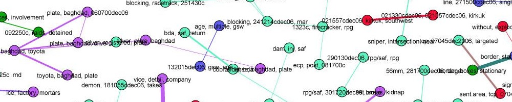
Week 9: Network analysis – 10/31
Slides.
Network analysis (aka social network analysis, link analysis) is a promising and popular technique for uncovering relationships between diverse individuals and organizations. It is widely used in intelligence and law enforcement, but not so much in journalism. We’ll look at basic techniques and algorithms and try to understand the promise — and the many practical problems.

Required

Recommended

Examples:

Assignment: Compare different centrality metrics in Gephi.

No class November 7th

Week 10: Drawing conclusions from data – 11/14
Slides.
You’ve loaded up all the data. You’ve run the algorithms. You’ve completed your analysis. But how do you know that you are right? It’s incredibly easy to fool yourself, but fortunately, there is a long history of fields grappling with the problem of determining truth in the face of uncertainty, from statistics to intelligence analysis.

Required

  • Correlation and causation, Business Insider
  • The Psychology of Intelligence Analysis, chapters 1,2,3 and 8. Richards J. Heuer

Recommended

Assignment: write a story on the status of women in science.

Week 11: Algorithmic Accountability – 11/21
Slides.
Our society is woven together by algorithms. From high frequency trading to predictive policing, they regulate an increasing portion of our lives. But these algorithms are mostly secret, black boxes form our point of view. We’re at they’re mercy, unless we learn how to interrogate and critique algorithms.

Required

Recommended

Week 12: Privacy, Security, and Censorship – 12/5
Slides.
Who is watching our online activities? How do you protect a source in the 21st Century? Who gets to access to all of this mass intelligence, and what does the ability to survey everything all the time mean both practically and ethically for journalism? In this lecture we will talk about who is watching and how, and how to create a security plan using threat modeling.

Required

Recommended

Assignment: Use threat modeling to come up with a security plan for a given scenario.

Week 13: Tracking flow and impact – 12/12
Slides.
How does information flow in the online ecosystem? What happens to a story after it’s published? How do items spread through social networks? We’re just beginning to be able to track ideas as they move through the network, by combining techniques from social network analysis and bioinformatics.

Required

Recommended

 Final projects due 12/19 (dual degree Journalism/CS students only)

Week 10: Security, Surveillance, and Privacy

Slides.

Who is watching our online activities? How do you protect a source in the 21st Century? Who gets to access to all of this mass intelligence, and what does the ability to survey everything all the time mean both practically and ethically for journalism? In this lecture we will talk about who is watching and how, and how to create a security plan using threat modeling.

Required

Recommended

Cryptographic security

Anonymity

Assignment: Use threat modeling to come up with a security plan for a given scenario.

Assignment 6: Threat Modeling

For this assignment, each of you will pick one of the four reporting scenarios below and design a security plan. More specifically, you will flesh out the scenario, create a threat model, come up with a plausible security plan, and analyze the weaknesses of your plan.

Start by creating a threat model, which must consider:

  • What must be kept private? Specify all of the information that must be secret, including notes, documents, files, locations, and identities — and possibly even the fact that someone is working on a story.
  • Who is the adversary and what do they want to know? It may be a single person, or an entire organization or state, or multiple entities. They may be very interested in certain types of information, e.g. identities, and uninterested in others. List each adversary and their interests.
  • What can they do to find out? List every way they could try to find out what you want secret, including technical, legal, and social methods.
  • What is the risk? Explain what happens if an adversary succeeds in breaking your security. What are the consequences, and to whom? Which of these is it absolutely necessary to avoid?

Once you have specified your your threat model, you are ready to design your security plan. The threat model describes the risk, and the goal of the security plan is to reduce that risk as much as possible.

Your plan must specify appropriate software tools, plus how these tools must be used. Pay particular attention to necessary habits: specify who must do what, and in what way, to keep the system secure. Explain how you will educate your sources and collaborators in the proper use of your chosen tools, and how hard you think it will be to make sure everyone does exactly the right thing.

Also document the weaknesses of your plan. What can still go wrong? What are the critical assumptions that will cause failure if it turns out you have guessed wrong? What is going to be difficult or expensive about this plan?

The scenarios you can choose from are:

1. You are a photojournalist in Syria with digital images you wants to get out of the country. Limited internet access is available at a cafe. Some of the images may identify people working with the rebels who could be targeted by the government if their identity is revealed. In addition you would like to remain anonymous until the photographs are published, so that you can continue to work inside the country for a little longer, and leave without difficulty.

2. You are working on an investigative story about the CIA conducting operations in the U.S., in possible violation the law. You have sources inside the CIA who would like to remain anonymous. You will occasionally meet with these sources in but mostly communicate electronically. You would like to keep the story secret until it is published, to avoid pre-emptive legal challenges to publication.

3. You are reporting on insider trading at a large bank, and talking secretly to two whistleblowers. If these sources are identified before the story comes out, at the very least you will lose your sources, but there might also be more serious repercussions — they could lose their jobs, or the bank could attempt to sue. This story involves a large volume of proprietary data and documents which must be analyzed.

4. You are working in Europe, assisting a Chinese human rights activist. The activist is working inside China with other activists, but so far the Chinese government does not know they are an activist and they would like to keep it this way. You have met the activist once before, in person, and have a phone number for them, but need to set up a secure communications channel.

These scenario descriptions are incomplete. Please feel free to expand them, making any reasonable assumptions about the environment or the story — though you must document your assumptions, and you can’t assume that you have unrealistic resources or that your adversary is incompetent.


Assignment 5: Statistical Inference

For this assignment you will analyze global data on the number of homicides versus the number of guns in each country. I’m giving you the data — your job is to tell me what it means. You will interpret a few different plots, and then implement the visual randomization procedure from the paper we discussed in class to examine a tricky case more closely.

The data is from The Guardian Data Blog. I simplified the header names, dropped a few unnecessary columns, and added an OECD column.

1. I’ve written most of the code you will need for this assignment, available from this github repo. (You can git clone if you like, otherwise just click here to download all files as a zip archive).

2. We are going to use the R language for this assignment. This is mostly because it has really nice built in charts (doing this in Python is a real pain), but also because you are likely to encounter R out in the real world of data journalism. Download and install it. To start R, enter R on the command line. To run a program, enter source(‘filename.R’) at the R command prompt A full language manual is here. You will only need to use a few basic concepts, such as random number generation and for loops.

3. Plot the data for all countries’ homicide rate (per 100,000) versus number of privately-owned firearms (per 100) by running source(‘plot-all-countries.R’) at the R prompt. What do you see? Please report on the general patterns here, the outliers, and what this all might mean.

4. Now take a look at only the OECD countries, by uncommenting the indicated line in the source. Re-run the file. What does the chart show now?

5. Now plot only the non-OECD countries, by uncommenting the indicated line in the source (be sure to re-comment the line that selects only OECD countries). What does the chart show now?

6. It looks like there might be a pattern among the OECD countries, but the United States is such an outlier that it’s hard to tell. Is this pattern still significant without the US? To find out, you’re going to apply a randomization test. (We’ll also remove Mexico since it’s not a developed country and thus not really comparable to the other OECD countries.)

Start with the file randomization-test.R. You need to write the code that performs the actual randomization, filling the eight of the columns of charts with random permutations of the original y values (homicide rates), but putting the original data in the realchart column. To prevent sneak peaks, the code is currently set up to use testing data. When your permutations are working right, you should see something like this when you run the file:

After pressing Enter, the program will tell you which chart has the real (un-permuted) data. Here, with fake data, it’s obvious. It won’t always be.

7. Now that your program works, try it on the real data by commenting out the two lines that generate the fake data. Re-run, and look at the plots carefully. Which one do you think is the real data? Write down the number of the chart. Then hit enter, and see if you got it right.

8. This isn’t quite fair, because you were already looking at the data in step 4. So get someone else to look at it fresh. Explain to them that you are charting firearms versus homicides and that one of the charts is real but the rest are fakes, and ask them to spot the real chart.

9. Did you guess right? Did your fresh observer guess right? Did you and your observer guess differently? If so, why do you think that is? Was it difficult for you to choose? Based on all of this, do you think there is a correlation between gun ownership and homicide rate for the OECD countries? If so, how strong is it (effect size) and how strong is the evidence (statistical significance)?

10. What does all this mean? Please write a short journalistic analysis of the global  relationship between firearms ownership and homicide rate, for a general audience. Your editor has asked you to do this analysis and is very interested in whether there is a causal relationship — whether more guns cause more crime — so you will have to include something about that.
Turn in: answers to questions in steps 3,4,5,7,8,9, your code, and your final short analysis article.


Week 9: Drawing Conclusions from Data

Slides.

You’ve loaded up all the data. You’ve run the algorithms. You’ve completed your analysis. But how do you know that you are right? It’s incredibly easy to fool yourself, but fortunately, there is a long history of fields grappling with the problem of determining truth in the face of uncertainty, from statistics to intelligence analysis.

Required

  • Correlation and causation, Business Insider
  • The Psychology of Intelligence Analysis, chapters 1,2,3 and 8. Richards J. Heuer

Recommended

 Discussed in class:

Week 8: Social Network Analysis

Slides.

Network analysis (aka social network analysis, link analysis) is a promising and popular technique for uncovering relationships between diverse individuals and organizations. It is widely used in intelligence and law enforcement, but not so much in journalism. We’ll look at basic techniques and algorithms and try to understand the promise — and the many practical problems.

Readings

Recommended

Examples:

Assignment 4: Social Network Analysis

For this assignment you will analyze a social network using three different centrality algorithms, and compare the results.

1. Download and install Gephi, a free graph analysis package. It is open source and runs on any OS.

2. Download the data file lesmis.gml from the UCI Network Data Repository.  This is a network extracted from the famous French novel Les Miserables — you may also be familiar with the musical and the recent movie. Each node is a character, and there is an edge between two characters if they appear in the same chapter. Les Miserables is written in over 300 short chapters, so two characters that appear in the same chapter are very likely to meet or talk in the plot of the book. Actually, the edges are weighted, and the weight is the number of chapters those characters appear together in.

3. Open this file in Gephi, by choosing File->Open. When the dialog box comes up, set the “Graph Type” type to “Undirected.” The graph will be plotted. What do you see? Can you discern any patterns?

4. Now arrange the nodes in a nicer way, by choosing the “Force Atlas 2″ layout algorithm from the Layout menu at left and pressing the “Run” button. When things settle down, hit the “Stop” button. The graph will be arranged nicely, but it will be quite small.  You can zoom in using the mouse wheel (or two fingers on the trackpad on a mac) and pan using the right mouse button.

5. Select the “Edit” tool from the bottom of the toolbar on the left. It looks like a mouse pointer with question mark next to it:

6. Now you can click on any node to see its label, which is the name of the character it represents. This information will appear in the “Edit” menu in the upper left. Here’s the information for the character Gavroche.

Click around the various nodes in the graph. Which characters have been given the most central locations? If you are familiar with the story of Les Miserables, how does this correspond to the plot? Are the most central nodes the most important characters?

7. Make Gephi color nodes by degree. Choose the “Ranking” tab from panel at the upper left, then select the “Nodes” tab, then “Degree” from the drop-down menu. Press the “Apply” button.

Now the nodes with the highest degree will be darker. Do these high degree nodes correspond to the nodes that the layout algorithm put in the center? Are they the main characters in the story?

8. Now make Gephi compute betweenness and closeness centrality by pressing the “Run” button for the Network Diameter option under “Network Overview” in to the right of the screen.

You will get a report with some graphs. Just click “Close”. Now betweenness and closeness centrality will appear in the drop-down under “Ranking,” in the same place where you selected degree centrality earlier, and you can assign colors based on either run by clicking the “Apply” button.

Also, the numerical values for betweenness centrality and closeness centrality will now appear in the “Edit” window for each node.

Select “Betweenness Centrality” from the drop-down meny and hit “Apply.” What do you see? Which characters are marked as important? How does it differ from the characters which are marked as important by degree?

Now selecte “Closeness Centrality” and hit “Apply.” (Note that this metric uses a scale which is the reverse of the others — closeness measures average distance to all other nodes, so small values indicate more central nodes. You may want to swap the black and white endpoints of the color scale to get something which is comparable to the other visualizations.) How does closeness centrality differ from betweeness centrality and degree? Which characters differ between closeness and the other metrics?

9. Turn in: your answers to the questions in steps 3, 6, 7 and 8, plus screenshots for the graph plotted with degree, betweenness centrality, and closeness centrality. (To take a screenshot: on Windows, use the Snipping Tool. On Mac, press ⌘ Cmd + ⇧ Shift + 4. If you’re on Linux, you get to tell me)

What I am interested in here is how the values computed by the different algorithms correspond to the plot of Les Miserables (if you are familiar with it), and how they compare to each other. Telling me that “Jean Valjean has a closeness centrality of X” is not a high-enough level interpretation — your couldn’t publish that in a finished story, because your readers won’t know what that means.


Week 7: Knowledge Representation

Slides.

Is journalism in the text/video/audio business, or is it in the knowledge business? This class we’ll look at this question in detail, which gets us deep into the issue of how knowledge is represented in a computer. The traditional relational database model is often inappropriate for journalistic work, so we’re going to concentrate on so-called “linked data” representations. Such representations are widely used and increasingly popular. For example Google recently released the Knowledge Graph. But generating this kind of data from unstructured text is still very tricky, as we’ll see when we look at th Reverb algorithm.

Required

Recommended

Assignment 3: Text enrichment experiments using OpenCalais entity extraction.

Week 6: Visualization

Slides.

An introduction into how visualisation helps people interpret  information. The difference between infographics and visualization, and between exploration and presentation. Design principles from user experience considerations, graphic design, and the study of the human visual system. Also, what is specific about visualization in journalism, as opposed to the many other fields that use it?

Readings.

Recommended