Assignment 3 Group 2: Bayesian Mixed Model Used with STAN

By Chi-An Wang, Dailin Shen=

Threshold Test Model

We believe the threshold test is a better model compared to the benchmark test and the outcome test. The benchmark test has the qualified pool problem that might overlook the case that the officers are doing good policing. The outcome test also has the problem of infra-marginality problem that might speculate discrimination while there is not. These two model have the advantage of easier to compute and intuitiveness but might neglect some of the key features in the process of policing.

Why do we think threshold test is a fair metric?

Being bias is having a double standard, and threshold test well mapped this concept to having a lower threshold of deciding to search the stopped driver. Simoiu added two important features, the subjective probabilities, and search threshold, as a latent variable into the threshold test model. The subjective probabilities p (the officers feeling about the driver possessing contraband) is drawn from a binomial distribution parameterized by 1. Phi_{rd} and lambda_{rd}. Phi_{rd} models the probability that a driver is carrying contraband and lambda express the difficulty in distinguishing between guilty and innocent drivers. The threshold is the most important latent variables inferred from data so that we can compare between different race.

This modeling makes sense since it models the real-world process of P making decisions. Rather than only based on the stop and frisk results, they assume that how the people reacted to the police and its appearance would also be taken into consideration into the beta distribution.  It also takes the difference between each precinct into consideration.

Although Police making a calibrated decision might not be totally realistic, but we would argue that the data that we’re modeling is a single year dataset of 2011. The long-term variation in this year might not be huge. For example, a young police might not be tough until working for several years while an old police might not change its way of policing after 30 years.

Data Preprocessing – iPython Notebook

1 Contraband

The paper “Testing for Racial Discrimination in Police Searches of Motor Vehicles” categorized four types of contrabands, including drugs, alcohol, weapons, and money. While, the description in the file specifications of the database ( NYPD Stop Question Frisk Database 2015) only showed a single type of contraband, which was the weapon. Also, we found the database concentrated more on different kinds of weapons, like rifles, pistols, assault weapons and knife cuttings. Hence we decided to use these four types of weapons as one of our proxies to prediction.

2 Race

There are eight different races in our dataset, which includes A(“Asian/Pacific Islander”), B(“Black”), I(“American Indian/Alaskan Native”), P(“Black-Hispanic”), Q(“White-Hispanic”), W(“White”), X(“Unknown”), Z(“Other”).  We decided to merge Black-Hispanic and White-Hispanic based on the assumption that people in the States, especially the officers, are capable of telling them apart from Black and White. Therefore to provide a slightly bigger dataset and make good use of them, we decided to merge them and drop all other smaller races.

3 Age

We noticed that the age in our dataset ranged from 0 to 999, although most of the ages clustered obeyed the normal distribution. To let calculation make more sense, according to news publications, we found that the longest age in the USA is 116, hence we omitted the observations with the age over 116.

Benchmark
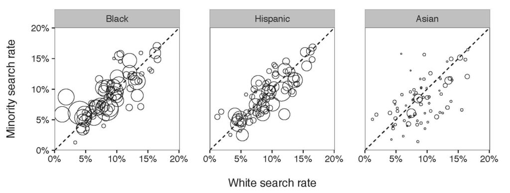
Figure 1: Results of benchmark on a department-by-department basis. Each circle in the diagram refers to a police department and the affiliated search rate of minority compared to White search rate.

Figure 1: Results of benchmark on a department-by-department basis. Each circle in the diagram refers to a police department and the affiliated search rate of minority compared to White search rate.

The X-axis in Figure 1 is the observed White search rate, and, the Y-axis is the observed Minority search rate. Each point in the diagram compares search rates of minority and white drivers for a single department. The size of a point illustrates the number of drivers being stopped by the department. We expect to see all the points locating on the diagonal line if there is no discrimination against minorities. Otherwise, if all the points locate above the diagonal line, a discrimination exists; if all the points locate below the diagonal line, there is no discrimination . According to Figure 1,  so far, we incline to say that there is a slightly discrimination against Black and slightly group, but no clear discrimination against Asian drivers.

Outcome
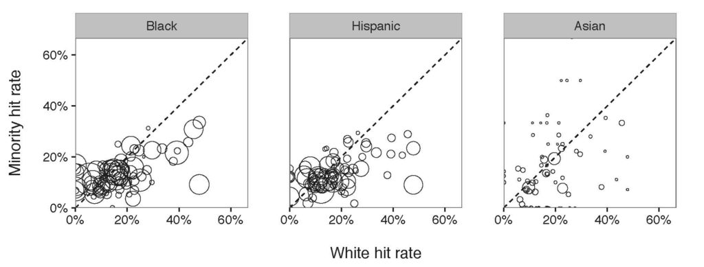
Figure 2: Results of outcome test on a department-by-department basis. Each circle in the diagram compares the corresponding department hit rates. Different with benchmark test, the outcome test showed that the majority of the police departments had a subtle discrimination against Black and Hispanic.

Figure 2: Results of outcome test on a department-by-department basis. Each circle in the diagram compares the corresponding department hit rates. Different with benchmark test, the outcome test showed that the majority of the police departments had a subtle discrimination against Black and Hispanic.

Similar to the Figure 1, if there is no discrimination, all the points in the diagram are expected to locate on the diagonal line. But if they are clustered below the line, we conclude that the hit rate of the minority is below that of White group, leading to a discrimination against the minority. According to Figure 2, the hit rate of Black and Hispanic are below the diagonal line, from which locate a discrimination against Black and Hispanic. Still, no discrimination shows against Asian drivers.

Threshold
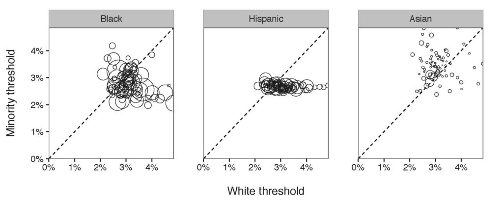
Figure 3: Diagram of the threshold tested computed on the 76 police departments in New York Island Area. Similarly, each point refers to the numbers of minorities stopped by each department. Most of the departments stopped Black with a lower threshold compared to White, meaning that a discrimination exists.

Figure 3: Diagram of the threshold tested computed on the 76 police departments in New York Island Area. Similarly, each point refers to the numbers of minorities stopped by each department. Most of the departments stopped Black with a lower threshold compared to White, meaning that a discrimination exists.

Out of expectation, in the Hispanic/White threshold diagram, all of the departments had almost the same threshold for Hispanic indicating that they were consistent while stopping Hispanic. However, their consistency still indicates a racial bias while having a lower search threshold for Hispanic.
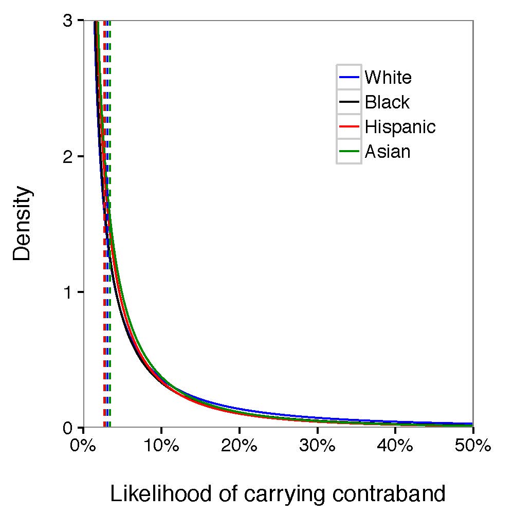
Figure 4: Averaging the race-specific search threshold and signal distribution among all the departments, we found that the likelihood of carrying contraband from Hispanic and Black was slightly lower than White and Asian given the density, suggestive of discrimination against Black and Hispanic. The gap between those four groups was not clear to claim that police forces were biased during stop and frisk operations.
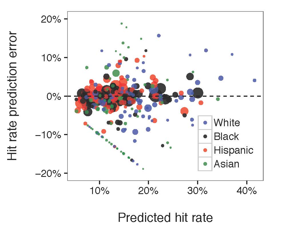
Figure 4: Averaging the race-specific search threshold and signal distribution among all the departments, we found that the likelihood of carrying contraband from Hispanic and Black was slightly lower than White and Asian given the density, suggestive of discrimination against Black and Hispanic. The gap between those four groups was not clear to claim that police forces were biased during stop and frisk operations.

search_rate_ppc

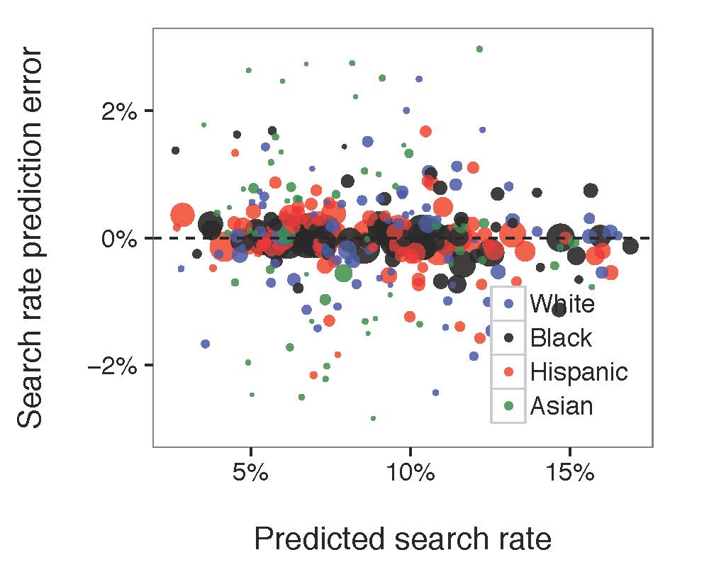
Figure 5: Compared the diagram of predicted search rate, the diagram of predicted hit rate to the actual, observed values. Each circle in the diagram referred to the associated race-paired department. The size of the circle represented the number of stops made by the related police department.

Figure 5: Compared the diagram of predicted search rate, the diagram of predicted hit rate to the actual, observed values. Each circle in the diagram referred to the associated race-paired department. The size of the circle represented the number of stops made by the related police department.

The model fitted well for both search rate and hit rate. No matter how much the search rate/hit rate grows, the prediction error was generally constant. Most of the large bubbles were around the middle line indicating that the model fits the larger groups of department-race pairs well. However, there is a mysterious straight line in the predicted hit rate/ hit rate prediction error chart that might be caused by our buggy data.

Debug Documentation

1 SUM()

Error in eval(substitute(expr), envir, enclos) :  ‘sum’ not meaningful for factors.

Variables in data frames are considered as factors.  However, the sum function doesn’t take factors as a valid input data type which caused the error while fitting data.

2 Binomial Indexes

“Exception thrown at line 104: binomial_log: Successes variable[231] is 8, but must be in the interval [0, 7]”

In order to find this bug, we tracked the r, n, s, h value of variable[231]. Here is what we found: r[231] = 4, n[231] = 17, s[231] = 7, h[231] = 8. The problem is obvious, the hit (h) count cannot be higher than search (s) count! This made us think about: is any chance in our database that some contrabands found without any search conducted? Fun fact, more than 3000 pieces of observations from more than 660,000 pieces showed without a search, officers still found contraband. Hence, we filtered out the rows with contraband found but without any search conducted and fixed the problem.

Reference:

Threshold test source code


Assignment 2: Filter design

For this assignment you will design a hybrid filtering algorithm. You will not implement it, but you will explain your design criteria and provide a filtering algorithm in sufficient technical detail to convince me that it might actually work — including psuedocode.

1. Decide who your users are. Journalists? Professionals? General consumers? Someone else?

2. Decide what you will filter. You can choose:

  • Facebook status updates, like the Facebook news feed
  • Tweets, like Trending Topics or the many Tweet discovery tools
  • The whole web, like Google News
  • something else, but ask me first

3. List all available information that you have available as input to your algorithm. If you want to filter Facebook or Twitter, you may pretend that you are the company running the service, and have access to all posts and user data — from every user. You also also assume you have a web crawler or a firehose of every RSS feed or whatever you like, but you must be specific and realistic about what data you are operating with.

4. Argue for the design factors that you would like to influence the filtering, in terms of what is desirable to the user, what is desirable to the publisher (e.g. Facebook or Prismatic), and what is desirable socially. Explain as concretely as possible how each of these (probably conflicting) goals might be achieved through in software. Since this is a hybrid filter, you can also design social software that asks the user for certain types of information (e.g. likes, votes, ratings) or encourages users to act in certain ways (e.g. following) that generate data for you.

5. Write psuedo-code for a function that produces a “top stories” list. This function will be called whenever the user loads your page or opens your app, so it must be fast and frequently updated. You can assume that there are background processes operating on your servers if you like. Your psuedo-code does not have to be executable, but it must be specific and unambiguous, such that I could actually go and implement it. You can assume that you have libraries for classic text analysis and machine learning algorithms. So, you don’t have to spell out algorithms like TF-IDF or item-based collaborative filtering, or anything else you can dig up in the research literature, but simply say how you’re going to use such building blocks. If you use an algorithm we haven’t discussed in class, be sure to provide a reference to it.

6. Write up steps 1-5. The result should be no more than three pages. You must be specific and plausible. You must be clear about what you are trying to accomplish, what your algorithm is, and why you believe your algorithm meets your design goals (though of course it’s impossible to know for sure without testing; but I want something that looks good enough to be worth trying.)

Due before class, October 21

Assignment 1: Topic Modeling

This assignment is designed to help you develop a feel for the way topic modeling works, the connection to the human meanings of documents, and common ways of handling a time dimension. You will analyze the State of the Union speeches corpus, and report on how the subjects have shifted over time in relation to historical events.

1. Download the source data file state-of-the-union.csv. This is a standard CSV file with one speech per row. There are two columns: the year of the speech, and the text of the speech. You will write a Python program that reads this file and turns it into TF-IDF document vectors, then prints out some information. Here is how to read a CSV in Python. You may need to add the line

csv.field_size_limit(1000000000)

to the top of your program to be able to read this large file.

The file is a csv with columns year, text. Note: there are some years where there was more than one speech! Design your data structures accordingly.

2) Feed the data into gensim. Now you need to load the documents into Python and feed them into the gensim package to generate tf-idf weighted document vectors. Check out the gensim example code here. You will need to go through the file twice: once to generate the dictionary (the code snippet starting with “collect statistics about all tokens”) and then again to convert each document to what gensim calls the bag-of-words representation, which is un-normalized term frequency (the code snippet starting with “class MyCorpus(object)”

Note that there is implicitly another step here, which is to tokenize the document text into individual word features — not as straightforward in practice as it seems at first, but the example code just does the simplest, stupidest thing, which is to lowercase the string and split on spaces. You may want to use a better stopword list, such as this one.

Once you have your Corpus object, tell gensim to generate tf-idf scores for you like so.

3) Do LSI topic modeling. You can apply LSI to the tf-idf vectors, like so. You will have to supply the number of topics to generate. Figuring out a good number is part of the assignment. Print out the resulting topics, each topic as a lists of word coefficients. Now, sample ten topics randomly from your set for closer analysis. Try to annotate each of these ten topics with a short descriptive name or phrase that captures what it is “about.” You will likely have to refer to the original documents that contain high proportions of that topic, and you will likely find that some topics have no clear concept.

Turn in: your annotated topics plus a comment on how well you feel each “topic” captured a real human concept.

4) Now do LDA topic modeling. Repeat the exercise of step 3 but with LDA instead, again trying to annotate ten randomly sampled topics. What is different?

Turn in: your annotated topics plus a comment on how LDA differed from LSI.

5) Now choose one of the following exercises:

a) Come up with a method to figure out how topics of speeches have changed over time. The goal is to summarize changes in the State of the Union speech in each decade of the 20th and 21st century. There are many different ways to use topic modeling to do this. Possibilities include: visualizations, grouping speeches by decade after topic modeling, and grouping speeches by decade before topic modeling. You can base your algorithm on either LSI or LDA, whichever you feel gives the most insight. Choose a method, then use your decade summarization algorithm to understand what the content of speeches was in each decade.

Turn in: a description of your decade summarization algorithm, and an analysis of how the topics of the State of the Union have changed over the decades of the 20th century. What patterns do you see? Can you connect the terms to major historical events? (wars, the great depression, assassinations, the civil rights movement, Watergate…)

or b) Analyze a different document set. Try LDA on a different document set, this collection of AP wire stories. Repeat the process of choosing the number of topics, fitting a model, and interpreting a random sample of 10 of them. Are the topics any clearer on this document set? If so, why? You may wish to look at previous LDA results on these documents, the top 20 words from 100 topics.

Turn in: your annotated topic sample, plus a description of the differences between the output on these documents vs. the State of the Union documents. Does one work better than the other? If so, define “better.”

This assignment is due Friday, October 7 at 10:00 AM. You may email me the results.

Assignment 5: Interpreting Data

For this assignment you will write a short news story about the status of women in academic science. You can use any sources you like. The recent paper Women in Academic Science: A Changing Landscape by Ceci. et al. contains a lot of data you might find relevant however I expect you to use multiple sources.

I will look for the following things in marking your story:

1) What question or questions are you using data to answer? “The status of women” could mean many different things. You must be clear about what you are writing about, and how this relates to the broader concept described by the words “the status of women in academic science.”

2) What data did you choose to get your answer? Please clearly present this data and explain what it means. Include tables or graphs if appropriate.

3) How was this data collected? How do you know it is accurate? How do you know it means what you think it means? I want to see that you have at least considered the questions on the “interview the data” slide.

4) What other hypotheses, if any, fit the data you have chosen? Why is your explanation more correct than the other possible explanations? Could multiple explanations be true at the same time?

5) Is there other data that supports your conclusion? What about non-data sources of information? We have discussed triangulation many times in class, and I want to see evidence of it here. A strong argument combines different types of evidence from different sources.

6) Have you accounted for the possibility that what you see in the data has happened by chance? What are the sources of random variation here, and why is the pattern you see not likely to occur by chance?

7) Your story must be a maximum of 500 words and written for a general audience. That means you cannot assume that the reader is familiar with data concepts. If you need to use an idea that would not be familiar to someone who has never studied statistics or worked with data, you must explain what that idea means.

Due Dec 18 before class.

Assignment 4: Social Network Analysis

For this assignment you will analyze a social network using three different centrality algorithms, and compare the results.

1. Download and install Gephi, a free graph analysis package. It is open source and runs on any OS.

2. Download the data file lesmis.gml from the UCI Network Data Repository.  This is a network extracted from the famous French novel Les Miserables — you may also be familiar with the musical and the recent movie. Each node is a character, and there is an edge between two characters if they appear in the same chapter. Les Miserables is written in over 300 short chapters, so two characters that appear in the same chapter are very likely to meet or talk in the plot of the book. The edges are weighted, and the weight is the number of chapters those characters appear together in.

3. Open this file in Gephi, by choosing File->Open. When the dialog box comes up, set the “Graph Type” type to “Undirected.” The graph will be plotted. What do you see? Can you discern any patterns?

4. Now arrange the nodes in a nicer way, by choosing the “Force Atlas 2″ layout algorithm from the Layout menu at left and pressing the “Run” button. When things settle down, hit the “Stop” button. The graph will be arranged nicely, but it will be quite small.  You can zoom in using the mouse wheel (or two fingers on the trackpad on a mac) and pan using the right mouse button.

5. Select the “Edit” tool from the bottom of the toolbar on the left. It looks like a mouse pointer with question mark next to it:

6. Now you can click on any node to see its label, which is the name of the character it represents. This information will appear in the “Edit” menu in the upper left. Here’s the information for the character Gavroche.

Click around the various nodes in the graph. Which characters have been given the most central locations? If you are familiar with the story of Les Miserables, how does this correspond to the plot? Are the most central nodes the most important characters?

7. Make Gephi color nodes by degree. Choose the “Ranking” tab from panel at the upper left, then select the “Nodes” tab, then “Degree” from the drop-down menu. Press the “Apply” button.

Now the nodes with the highest degree will be darker. Do these high degree nodes correspond to the nodes that the layout algorithm put in the center? Are they the main characters in the story?

8. Now make Gephi compute betweenness and closeness centrality by pressing the “Run” button for the Network Diameter option under “Network Overview” in to the right of the screen.

You will get a report with some graphs. Just click “Close”. Now betweenness and closeness centrality will appear in the drop-down under “Ranking,” in the same place where you selected degree centrality earlier, and you can assign colors based on either run by clicking the “Apply” button.

Also, the numerical values for betweenness centrality and closeness centrality will now appear in the “Edit” window for each node.

Select “Betweenness Centrality” from the drop-down meny and hit “Apply.” What do you see? Which characters are marked as important? How does it differ from the characters which are marked as important by degree?

Now selecte “Closeness Centrality” and hit “Apply.” (Note that this metric uses a scale which is the reverse of the others — closeness measures average distance to all other nodes, so small values indicate more central nodes. You may want to swap the black and white endpoints of the color scale to get something which is comparable to the other visualizations.) How does closeness centrality differ from betweeness centrality and degree? Which characters differ between closeness and the other metrics?

9. Which centrality algorithm would you prefer to use to understand the structure of Les Miserables? Why? How would you validate your choice if you didn’t already know the story? That is the situation a journalist is in when they analyze unknown data.

10. Turn in: your answers to the questions in steps 3, 6, 7, 8 and 9, plus screenshots for the graph plotted with degree, betweenness centrality, and closeness centrality. (To take a screenshot: on Windows, use the Snipping Tool. On Mac, press ⌘ Cmd + ⇧ Shift + 4. If you’re on Linux, you get to tell me)

What I am interested in here is how the values computed by the different algorithms correspond to the plot of Les Miserables (if you are familiar with it), and how they compare to each other. Telling me that “Jean Valjean has a closeness centrality of X” is not a high-enough level interpretation — your couldn’t publish that in a finished story, because your readers won’t know what that means.


Assignment 6: Threat Modeling

For this assignment, each of you will pick one of the four reporting scenarios below and design a security plan. More specifically, you will flesh out the scenario, create a threat model, come up with a plausible security plan, and analyze the weaknesses of your plan.

Start by creating a threat model, which must consider:

  • What must be kept private? Specify all of the information that must be secret, including notes, documents, files, locations, and identities — and possibly even the fact that someone is working on a story.
  • Who is the adversary and what do they want to know? It may be a single person, or an entire organization or state, or multiple entities. They may be very interested in certain types of information, e.g. identities, and uninterested in others. List each adversary and their interests.
  • What can they do to find out? List every way they could try to find out what you want secret, including technical, legal, and social methods.
  • What is the risk? Explain what happens if an adversary succeeds in breaking your security. What are the consequences, and to whom? Which of these is it absolutely necessary to avoid?

Once you have specified your your threat model, you are ready to design your security plan. The threat model describes the risk, and the goal of the security plan is to reduce that risk as much as possible.

Your plan must specify appropriate software tools, plus how these tools must be used. Pay particular attention to necessary habits: specify who must do what, and in what way, to keep the system secure. Explain how you will educate your sources and collaborators in the proper use of your chosen tools, and how hard you think it will be to make sure everyone does exactly the right thing.

Also document the weaknesses of your plan. What can still go wrong? What are the critical assumptions that will cause failure if it turns out you have guessed wrong? What is going to be difficult or expensive about this plan?

The scenarios you can choose from are:

1. You are a photojournalist in Syria with digital images you wants to get out of the country. Limited internet access is available at a cafe. Some of the images may identify people working with the rebels who could be targeted by the government if their identity is revealed. In addition you would like to remain anonymous until the photographs are published, so that you can continue to work inside the country for a little longer, and leave without difficulty.

2. You are working on an investigative story about the CIA conducting operations in the U.S., in possible violation the law. You have sources inside the CIA who would like to remain anonymous. You will occasionally meet with these sources in but mostly communicate electronically. You would like to keep the story secret until it is published, to avoid pre-emptive legal challenges to publication.

3. You are reporting on insider trading at a large bank, and talking secretly to two whistleblowers. If these sources are identified before the story comes out, at the very least you will lose your sources, but there might also be more serious repercussions — they could lose their jobs, or the bank could attempt to sue. This story involves a large volume of proprietary data and documents which must be analyzed.

4. You are reporting on drug cartels in Mexico. You have found a source via an anonymous social media account who says they can give you more information on recent drug-related murders. You would like to arrange to meet with them, and get information from them, without revealing who they are or where your information came from.

These scenario descriptions are incomplete. Please feel free to expand them, making any reasonable assumptions about the environment or the story — though you must document your assumptions, and you can’t assume that you have unrealistic resources or that your adversary is incompetent.


Assignment 5: Interpreting Data

For this assignment you will write a short news story about the status of women in academic science. You can use any sources you like, however the recent paper Women in Academic Science: A Changing Landscape by Ceci. et al. contains a lot of data you might find relevant.

I will look for the following things in marking your story:

1) What question or questions are you using data to answer? “The status of women” could mean many different things. You must be clear about what you are writing about, and how this relates to the broader concept described by the words “the status of women in academic science.”

2) What data did you choose to get your answer? Please clearly present this data and explain what it means. Include tables or graphs if appropriate.

3) How was this data collected? How do you know it is accurate? How do you know it means what you think it means? I want to see that you have at least considered the questions on the “interview the data” slide.

4) What other hypotheses, if any, fit the data you have chosen? Why is your explanation more correct than the other possible explanations?

5) Is there other data that supports your conclusion? What about non-data sources of information? We have discussed triangulation many times in class, and I want to see evidence of it here. A strong argument combines different types of evidence from different sources.

6) Have you accounted for the possibility that what you see in the data has happened by chance? What are the sources of random variation here, and why is the pattern you see not likely to occur by chance?

7) Your story must be a maximum of 500 words and written for a general audience. That means you cannot assume that the reader is familiar with data concepts. If you need to use an idea that would not be familiar to someone who has never studied statistics or worked with data, you must explain what that idea means.

Due Dec 5 before class.

Assignment 4: Social Network Analysis

For this assignment you will analyze a social network using three different centrality algorithms, and compare the results.

1. Download and install Gephi, a free graph analysis package. It is open source and runs on any OS.

2. Download the data file lesmis.gml from the UCI Network Data Repository.  This is a network extracted from the famous French novel Les Miserables — you may also be familiar with the musical and the recent movie. Each node is a character, and there is an edge between two characters if they appear in the same chapter. Les Miserables is written in over 300 short chapters, so two characters that appear in the same chapter are very likely to meet or talk in the plot of the book. Actually, the edges are weighted, and the weight is the number of chapters those characters appear together in.

3. Open this file in Gephi, by choosing File->Open. When the dialog box comes up, set the “Graph Type” type to “Undirected.” The graph will be plotted. What do you see? Can you discern any patterns?

4. Now arrange the nodes in a nicer way, by choosing the “Force Atlas 2″ layout algorithm from the Layout menu at left and pressing the “Run” button. When things settle down, hit the “Stop” button. The graph will be arranged nicely, but it will be quite small.  You can zoom in using the mouse wheel (or two fingers on the trackpad on a mac) and pan using the right mouse button.

5. Select the “Edit” tool from the bottom of the toolbar on the left. It looks like a mouse pointer with question mark next to it:

6. Now you can click on any node to see its label, which is the name of the character it represents. This information will appear in the “Edit” menu in the upper left. Here’s the information for the character Gavroche.

Click around the various nodes in the graph. Which characters have been given the most central locations? If you are familiar with the story of Les Miserables, how does this correspond to the plot? Are the most central nodes the most important characters?

7. Make Gephi color nodes by degree. Choose the “Ranking” tab from panel at the upper left, then select the “Nodes” tab, then “Degree” from the drop-down menu. Press the “Apply” button.

Now the nodes with the highest degree will be darker. Do these high degree nodes correspond to the nodes that the layout algorithm put in the center? Are they the main characters in the story?

8. Now make Gephi compute betweenness and closeness centrality by pressing the “Run” button for the Network Diameter option under “Network Overview” in to the right of the screen.

You will get a report with some graphs. Just click “Close”. Now betweenness and closeness centrality will appear in the drop-down under “Ranking,” in the same place where you selected degree centrality earlier, and you can assign colors based on either run by clicking the “Apply” button.

Also, the numerical values for betweenness centrality and closeness centrality will now appear in the “Edit” window for each node.

Select “Betweenness Centrality” from the drop-down meny and hit “Apply.” What do you see? Which characters are marked as important? How does it differ from the characters which are marked as important by degree?

Now selecte “Closeness Centrality” and hit “Apply.” (Note that this metric uses a scale which is the reverse of the others — closeness measures average distance to all other nodes, so small values indicate more central nodes. You may want to swap the black and white endpoints of the color scale to get something which is comparable to the other visualizations.) How does closeness centrality differ from betweeness centrality and degree? Which characters differ between closeness and the other metrics?

9. Which centrality algorithm would you prefer to use to understand the structure of Les Miserables? Why? How would you validate your choice if you didn’t already know the story? That is the situation a journalist is in when they analyze unknown data.

10. Turn in: your answers to the questions in steps 3, 6, 7, 8 and 9, plus screenshots for the graph plotted with degree, betweenness centrality, and closeness centrality. (To take a screenshot: on Windows, use the Snipping Tool. On Mac, press ⌘ Cmd + ⇧ Shift + 4. If you’re on Linux, you get to tell me)

What I am interested in here is how the values computed by the different algorithms correspond to the plot of Les Miserables (if you are familiar with it), and how they compare to each other. Telling me that “Jean Valjean has a closeness centrality of X” is not a high-enough level interpretation — your couldn’t publish that in a finished story, because your readers won’t know what that means.


Assignment 3: Entity Extraction

For this assignment you will evaluate the performance of OpenCalais, a commercial entity extraction service. You’ll do this by building a text enrichment program, which takes plain text and outputs HTML with links to the detected entities. Then you will take five random news articles, enrich them, and manually count how many entities OpenCalais missed or got wrong.

1. Get an OpenCalais API key, from this page.

2. Install the python-calais module. This will allow you to call OpenCalais from Python easily. First, download the latest version of python-calais. To install it, you just need calais.py in your working directory. You will probably also need to install the simplejson Python module. Download it, then run “python setup.py install.” You may need to execute this as super-user.

3. Call OpenCalais from Python. Make sure you can successfully submit text and get the results back, following these steps. The output you want to look at is in the entities array, which would be accessed as “results.entities” using the variable names in the sample code. In particular you want the list of occurrences for each entity, in the “instances” field.

>>> result.entities[0]['instances']
[{u'suffix': u' is the new President of the United States', u'prefix': u'of the United States of America until 2009.  ', u'detection': u'[of the United States of America until 2009.  ]Barack Obama[ is the new President of the United States]', u'length': 12, u'offset': 75, u'exact': u'Barack Obama'}]
>>> result.entities[0]['instances'][0]['offset']
75
>>>

Each instance has “offset” and “length” fields that indicate where in the input text the entity was referenced. You can use these to determine where to place links in the output HTML.

4. Read a text file, create hyperlinks, and write it out. Your Python program should read text from stdin and write HTML with links on all detected entities to stdout. There are two cases to handle, depending on how much information OpenCalais gives back.

In many cases, like the example in step 3, OpenCalais will not be able to give you any information other than the string corresponding to the entity, result.entities[x][‘name’]. In this case you should construct a Wikipedia link by simply appending to the name to a Wikipedia URL, converting spaces to underscores, e.g.

http://en.wikipedia.org/wiki/Barack_Obama

In other cases, especially companies and places, OpenCalias will supply a link to an RDF document that contains more information about the entity. For example.

>>> result.entities[0]{u'_typeReference': u'http://s.opencalais.com/1/type/em/e/Company', u'_type': u'Company', u'name': u'Starbucks', '__reference': u'http://d.opencalais.com/comphash-1/6b2d9108-7924-3b86-bdba-7410d77d7a79', u'instances': [{u'suffix': u' in Paris.', u'prefix': u'of the United States now and likes to drink at ', u'detection': u'[of the United States now and likes to drink at ]Starbucks[ in Paris.]', u'length': 9, u'offset': 156, u'exact': u'Starbucks'}], u'relevance': 0.314, u'nationality': u'N/A', u'resolutions': [{u'name': u'Starbucks Corporation', u'symbol': u'SBUX.OQ', u'score': 1, u'shortname': u'Starbucks', u'ticker': u'SBUX', u'id': u'http://d.opencalais.com/er/company/ralg-tr1r/f8512d2d-f016-3ad0-8084-a405e59139b3'}]}
>>> result.entities[0]['resolutions'][0]['id']
u'http://d.opencalais.com/er/company/ralg-tr1r/f8512d2d-f016-3ad0-8084-a405e59139b3'
>>>

In this case the resolutions array will contain a hyperlink for each resolved entity, and this is where your link should go. The linked page will contain a series of triples (assertions) about the entity, which you can obtain in machine-readable from by changing the .html at the end of the link to .json. The sameAs: links are particularly important because they tell you that this entity is equivalent to others in dbPedia and elsewhere.

Here is more on OpenCalias’ entity disambiguation and use of linked data.

The final result should look something like below. Note that some links go to OpenCalais entity pages with RDF links on them (“London”), some go to Wikipedia (“politician”) and some are broken links when Wikipedia doesn’t have the topic (“Aarthi Ramachandran”) And of course Mr Gandhi is an entity that was not detected, three times.

The latest effort to “decode” Mr Gandhi comes in the form of a limited yet rather well written biography by a political journalist, Aarthi Ramachandran. Her task is a thankless one. Mr Gandhi is an applicant for a big job: ultimately, to lead India. But whereas any other job applicant will at least offer minimal information about his qualifications, work experience, reasons for wanting a post, Mr Gandhi is so secretive and defensive that he won’t respond to the most basic queries about his studies abroad, his time working for a management consultancy in London, or what he hopes to do as a politician.

Don’t worry about producing a fully valid HTML document with headers and a <body> tag, just wrap each entity with <a href=”…”> and </a>. Your browser will load it fine.

5. Pick five random news stories and enrich them. Pick an English-language news site with many stories on the home page, or a section of such a site (business, sports, etc.) Then generate five random numbers from 1 to the number of stories on the page. Cut and paste the text of each article into a separate  file, and save as plain text (no HTML, no formatting.)

6. Read the enriched documents and count to see how well OpenCalais did. You need to read each output document very carefully and count three things:

  • Entity references. Count each time there is a name of a person, place, or organization appears, or other references to these things (e.g. “the president.”)
  • Detected references. How many of these references did OpenCalais find?
  • Correct references. How many of the links go to the right page? Did our hyperlinking strategy (OpenCalais RDF pages where possible, Wikipedia when not) fail to correctly disambiguate any of the references, or, even worse, disambiguate any to the wrong object? Also, a broken link counts as an incorrect reference.

7. Turn in your work. Please turn in:

  • Your code
  • The enriched output from your documents
  • A brief report describing your results.
  • The totals as described below

The report should include a table of the three numbers — references, detected, correct — for each document, plus the totals of these three numbers across all documents. Also report on any patterns in the failures that your see. Where is OpenCalais most accurate? Where is it least accurate? Are there predictable patterns to the errors?

This assignment is due before class on Wednesday,  October 30.

Assignment 2: Filter Design

For this assignment you will design a hybrid filtering algorithm. You will not implement it, but you will explain your design criteria and provide a filtering algorithm in sufficient technical detail to convince me that it might actually work — including psuedocode.

1. Decide who your users are. Journalists? Professionals? General consumers? Someone else?

2. Decide what you will filter. You can choose:

  • Facebook status updates, like the Facebook news feed
  • Tweets, like Trending Topics or the many Tweet discovery tools
  • The whole web, like Prismatic
  • something else, but ask me first

3. List all available information that you have available as input to your algorithm. If you want to filter Facebook or Twitter, you may pretend that you are the company running the service, and have access to all posts and user data — from every user. You also also assume you have a web crawler or a firehose of every RSS feed or whatever you like, but you must be specific and realistic about what data you are operating with.

4. Argue for the design factors that you would like to influence the filtering, in terms of what is desirable to the user, what is desirable to the publisher (e.g. Facebook or Prismatic), and what is desirable socially. Explain as concretely as possible how each of these (probably conflicting) goals might be achieved through in software. Since this is a hybrid filter, you can also design social software that asks the user for certain types of information (e.g. likes, votes, ratings) or encourages users to act in certain ways (e.g. following) that generate data for you.

5. Write psuedo-code for a function that produces a “top stories” list. This function will be called whenever the user loads your page or opens your app, so it must be fast and frequently updated. You can assume that there are background processes operating on your servers if you like. Your psuedo-code does not have to be executable, but it must be specific and unambiguous, such that I could actually go and implement it. You can assume that you have libraries for classic text analysis and machine learning algorithms. So, you don’t have to spell out algorithms like TF-IDF or item-based collaborative filtering, or anything else you can dig up in the research literature, but simply say how you’re going to use such building blocks. If you use an algorithm we haven’t discussed in class, be sure to provide a reference to it.

6. Write up steps 1-5. The result should be no more than three pages. You must be specific and plausible. You must be clear about what you are trying to accomplish, what your algorithm is, and why you believe your algorithm meets your design goals (though of course it’s impossible to know for sure without testing; but I want something that looks good enough to be worth trying.)

Due before class, October 24