Week 3: Document Topic Modeling

The text processing algorithms we discussed this week are used in just about everything: search engines, document set visualization, figuring out when two different articles are about the same story, finding trending topics. The vector space document model is fundamental to algorithmic handling of news content, and we will need it to understand how just about every filtering and personalization system works.

Slides.

Here’s a slide I made showing the difference between TF and TF-IDF on the structure of the document vector space. I’m sure someone has tried this before, but It’s the first such comparison that I’ve seen, and matches the theoretical arguments put forth by Salton in 1975.

Here were the readings (from the syllabus):

  • Online Natural Language Processing Course, Stanford University
    • Week 7: Information Retrieval, Term-Document Incidence Matrix
    • Week 7: Ranked Information Retrieval, Introducing Ranked Retrieval
    • Week 7: Ranked Information Retrieval, Term Frequency Weighting
    • Week 7: Ranked Information Retrieval, Inverse Document Frequency Weighting
    • Week 7: Ranked Information Retrieval, TF-IDF weighting
  • Probabilistic Topic Models, David M. Blei
  • A full-text visualization of the Iraq war logs, Jonathan Stray
  • Latent Semantic Analysis, Peter Wiemer-Hastings
  • Probabilistic Latent Semantic Indexing, Hofmann
  • Introduction to Information Retrieval Chapter 6, Scoring, Term Weighting, and The Vector Space Model, Manning, Raghavan, and Schütze.

Jeff Larson of ProPublica came and spoke to us about his work on Message Machine, which uses tf-idf to cluster and “reverse engineer” the campaign emails from Obama and Romney.

I mentioned that it’s possible to do better than TF-IDF weighting but not hugely, and that using bigrams as features doesn’t help much. My personal favorite research on term-weighting uses a genetic algorithm to evolve optimal formulas. (All of these discussions of “best” are measured with respect to a set of documents manually tagged as relevant/not relevant to specific test queries, which matches search engine use but may not be what we want for specific journalistic inquiries.)

Finally, you may be interested to know that TF-IDF + LSA  + cosine similarity has a correlation of 0.6 with asking humans to rate the similarity of two documents on a linear scale, which is just as strongly as different human estimates correlate with each other. In a certain sense, it is not possible to create a better document similarity algorithm because there isn’t a consistent human definition of such a concept. However, these experiments were done on short news articles and it might be possible to do very much better over specialized domains.

This week we also started Assignment 1.

Using clustering to analyze the voting blocs in the UK House of Lords

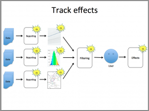
In this week’s class, we discussed clustering algorithms and their application to journalism. As an example, we built a distance metric to measure the similarity of the voting history between two members of the UK House of Lords, and used it with multi-dimensional scaling to visualize the voting blocs.

The data comes from The Public Whip, an independent site that scrapes the British parliamentary proceedings (the “hansard“) and extracts the voting record into a database. The files for the House of Lords are here. They’re tab-delimited, which is not the easiest format for R to read, so I opened them in Excel and re-saved as CSV. I also removed the descriptive header information from votematrix-lords.txt (which, crucially, explains how the vote data is formatted.)

The converted data files plus the scripts I used in class are up on GitHub. To get them running, first you’ll need to install R for your system. Then you’ll need the “proxy” package, which I have conveniently included with the files. To install proxy: on WIndows, “R CMD INSTALL proxy_0.4-9.zip” from the command line. On Mac, “R CMD INSTALL proxy_0.4-9.tgz” from  Terminal.

Then start R, and enter source(“lords-votes.R”)

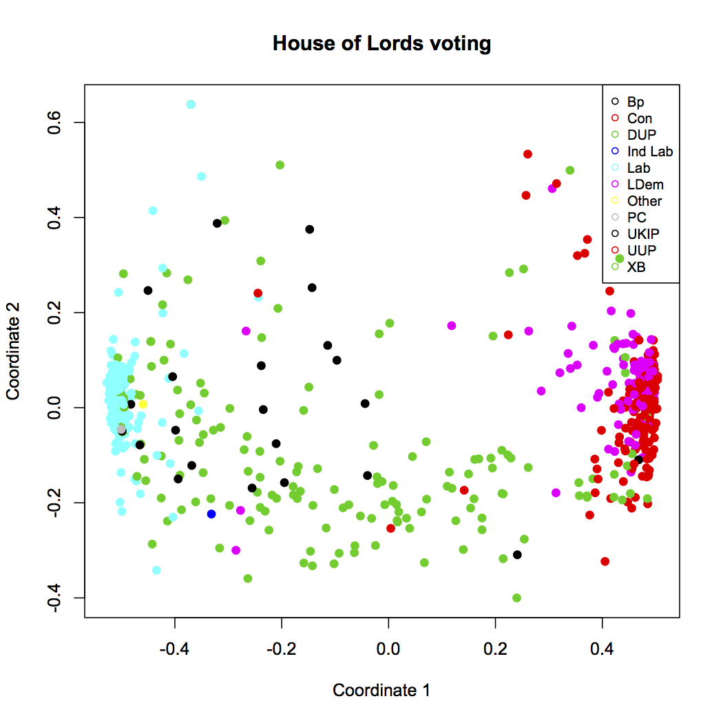
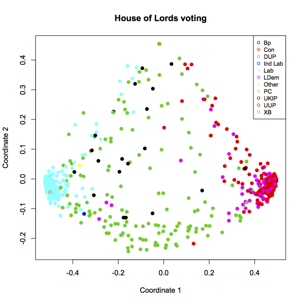
You should see this (click for larger):

And voila! There’s a lot of structure here. The blue cluster on the left are all the lords of the Labor party. The red dots in the cluster on the right are likewise members of the Conservative party, who are currently in a coalition government with Liberal Democrats — magenta, and mostly overlapping the conservative cluster. The green dots throughout the figure are the crossbenchers, and we can see that they really are indpendent. The scattered black dots are the Bishops, who don’t seem to vote together or, really, quite like anyone else, but are vaguely leftist.

Let’s break down how we made this plot — which will also illuminate how to interpret it, and how much editorial choice went into its construction. No visualization is gospel, though, as we shall see, there are reasons to believe that what this one is telling us is accurate.

The first section of lords-votes.R just loads in the data, and convers the weird encoding (2=aye, 4=nay, -9=not present, etc.) into a matrix of 1 for aye, -1 for nay, and 0 did not vote. The votes matrix ends up with 1043 rows, each of which contains the votes cast by a single Lord on 1630 occasions.

The next section truncates this to the 100 most recent votes. The 1630 votes in this file go back to 1999, and the voting patterns might have changed substantially over that time. Besides, over 200 Lords have retired since then. So we arbitrarily drop all but the last 100 votes, which gives a period of voting history stretching back to mid-November 2011. A more sophisticated analysis could look at how the voting blocs might have varied over time.

Then we get to the distance function, which is the heart of the code.  We have to write a function that takes two vectors of votes, representing the voting history of two Lords, and returns the “distance” between them. This function can take any form but it has to obey the definition of a distance metric. That definition says zero means “identical,” but doesn’t put any constraint on the maximum “distance” between Lords. For simplicity and numerical stability, we’ll say the distance varies from zero (identical voting) to one (no votes in common.)

For our distance function, we just count the fraction of votes where Lord 1 and Lord 2 voted the same (or rather, one minus this fraction, so identical = zero.)  Except that not every Lord voted on every issue. So, we first find the overlap of issues where they both voted, and then count their identical votes on that subset. (If there is no overlap, we return 1, i.e. as far apart as possible)

# distance function = 1 - fraction of votes where both voted, and both voted the same
votedist <- function(v1, v2) {
   overlap = v1!=0 & v2!=0
   numoverlap = sum(overlap)
   match = overlap & v1==v2
   nummatch = sum(match)
   if (!numoverlap) 
      dist = 1 
   else 
      dist = 1- (nummatch/numoverlap)
   dist
}

With this distance function in hand, we can create a distance matrix. In the final section of the script, we pass this distance function to R’s built-in multi-dimensional scaling function, mdscale. And then we plot, using the party as a color. That plot again:

And there we are, with our voting blocs: Labour (blue), Conservative (red) with Liberal Democrats (magenta), the crossbenchers (green), and the Bishops (black).

But now we have to step back and ask — is this “objective”? Is this “real”? The plot seems like it comes right from the data, but consider: we wrote a distance function. There’s no particular reason our little distance function is the “right” way to compare Lords, journalistically speaking. We also decided to use multidimensional scaling here, whereas there are other techniques for visualizing voting spatially, such as the well known NOMINATE algorithm.

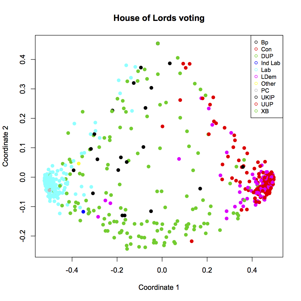
Also, the chart is very abstract. There seems to be a clear left-right axis, but what does the vertical axis mean? We know that MDS tries to keep distant points far away, so something is driving the dots near the top of the chart away from the others… but what does this really mean? Consider that we’ve already added a layer of interpretation by coloring by party affiliation; here’s the same chart without the color:

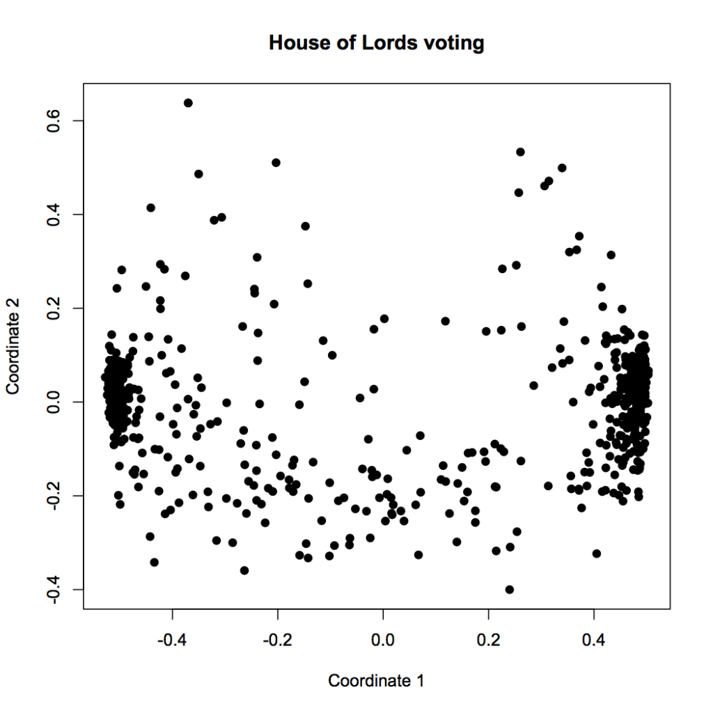
A lot less clear, isn’t it? Yes, our clustering tricks made us a chart, but to understand what it means, we have to supply context from outside the data. In this case, we know that voting behavior likely has a lot to do with party affiliation, so we chose to use party as an indpendent variable. You can think of it like this: in the colored plot, we’re graphing party against clustered coordinate. The fact that the clusters have clear solid colors means that, as we suspected, party is strongly correlated with voting history. The fact that Labor and Conservative are on opposite ends also makes sense, because we already imagine them to be on different ends of the political spectrum.

But what about the vertical axis? It doesn’t seem to correlate particularly well with party. What does it mean? Well, we’d have to dig into the data to see what the distance function and MDS algorithm have done here, and try to come up with an explanation. (And actually, the second dimension may not mean much at all — there is good evidence, from the NOMINATE research, that at least American voting behavior is typically only one-dimensional.)

In other words, it’s the human that interprets the plot, not the computer. The description at the start of this post of what this visualization tells us — the computer didn’t write that.

Let’s try a different distance function to see the effect of this piece of the algorithm. Our current distance function ignores the total number of votes where both Lords were present. If two Lords only voted on the same issue once, but they voted the same way, it will still score them as identical. That doesn’t seem quite right.

So let’s modify the crucial line of the distance function to penalize voting histories that don’t overlap much. (You can try this yourself by uncommenting line 47 in lords-votes.r)

 
      dist = 1- ((nummatch/numoverlap) * log(numoverlap)/log(Nvotes))

I’ve multiplied the fraction of matching votes by the fraction of issues that both Lords voted on (out of the possible Nvotes=100 most recent issues that we’re looking at.) I’ve also put a logarithm in there to compress the scale, because I want going from 5 to 10 votes to count more than going from 95 to 100 votes. This is all just made up, right out of my head, on the intuition that I want the distances to get large when there aren’t really enough overlapping votes to really say if two Lords are voting similarly or not. The resulting plot looks like this:

A bunch of Lords have been pushed up near the top of the diagram — away from everything else. These must be the Lords who didn’t participate in many votes, so our distance function says they’re not that close to anyone, really. But the general structure is preserved. This is a good sign. If what the visualization tells us is similar even when we try it lots of different ways, the result is robust and probably real. And I certainly recommend looking at your data lots of different ways — if you just pick the first chart that shows what you wanted to say anyway, that’s not journalism, it’s confirmation bias.

I want to leave you with one final thought, something even more fundamental than the choice of distance function or visualization algorithm: is voting record really the best way to see how politicians operate? What about all the other things they do? We could equally well ask about legislation they’ve drafted or the committees they’ve participated in. (We could even imagine defining a distance function based on the topics of the legislation that each representative has contributed to shaping.) As always, the first editorial choice is where to look.

Week 2: Clustering

A vector of numbers is a fundamental data representation which forms the basis of very many algorithms in data mining, language processing, machine learning, and visualization. This week we will looked in depth at two things: representing objects as vectors, and clustering them, which might be the most basic thing you can do with this sort of data. This requires a distance metric and a clustering algorithm — both of which involve editorial choices. In journalism we can use clusters to find groups of similar documents, analyze how politicians vote together, or automatically detect groups of crimes.

Slides for week 2 are here.

See also a discussion of (and files for reproducing) the UK House of Lords voting analysis we did in class, this one:

Here are the main references on this material (from the syllabus):

And here are some of the other things we looked at today:

Other uses of clustering in journalism:

Week 1

Here are the slides for Week 1, class of 10 September.

You will need to choose a data set to work on by the 24th. Here are some of the projects and data sources we discussed in class, which might provide inspiration — but pretty much anything of public interest is fair game. Remember, there are many types of data: documents, tables of numbers, networks of relationships, images, and more.

Syllabus – Fall 2012

Aims of the course

The aim of the course is to familiarise students with current areas of research and development within computer science that have a direct relevance to the field of journalism, so that they are capable of participating in the design of future public information systems.

The course is built around a “design” frame that examines technology from the point of view of its possible applications and social context. It will familiarize the students with both the major unsolved problems of internet-era journalism, and the major areas of research within computer science that are being brought to bear on these problems. The scope is wide enough to include both relatively traditional journalistic work, such as computer-assisted investigative reporting, and the broader information systems that we all use every day to inform ourselves, such as search engines. The course will provide students with a thorough understanding of how particular fields of computational research relate to products being developed for journalism, and provoke ideas for their own research and projects.

Research-level computer science material will be discussed in class, but the emphasis will be on understanding the capabilities and limitations of this technology. Students with a CS background will have opportunity for algorithmic exploration and innovation, however the primary goal of the course is thoughtful, application-centered research and design.

Assignments will be completed in groups and involve experimentation with fundamental computational techniques. There will be some light coding, but the emphasis will be on thoughtful and critical analysis.

Format of the class, grading and assignments.

It is a fourteen week course for Masters’ students which has both a six point and a three point version. The six point version is designed for dual degree candidates in the journalism and computer science concentration, while the three point version is designed for those cross listing from other concentrations and schools.

The class is conducted in a seminar format. Assigned readings and computational techniques will form the basis of class discussion. Throughout the semester we will be inviting guest speakers with expertise in the relevant areas to talk about their related research and product development

The output of the course for a 6pt candidate will be one research assignment in the form of a 25-page research paper. The three point course will require a shorter research paper, and both versions of the course will also have approximately bi-weekly written assignmenst which will frequently involve experimentation with computational techniques. For those in the dual degree program or who have strong technical skills, there is an option to produce a prototype as part of the final assignment. The class is conducted on pass/fail basis for grading, in line with the journalism school’s grading system.

Week 1. – Basics
We set out the expectations of the course, and frame our work as the task of designing of public information production and distribution systems. Computer science techniques can help in four different areas: data-driven reporting, story presentation, information filtering, and effect tracking. The recommended readings are aiming to to give you an understanding of the landscape of technical disruption in the news industry, and the ways in which computer science techniques can help to build something better.

Required

Recommended

  • Newspapers and thinking the Unthinkable, Clay Shirky
  • Computational Journalism, Cohen, Turner, Hamilton,
  • Precision Journalism, Ch.1, Journalism and the Scientific Tradition, Philip Meyer

Viewed in class

Weeks 2-3: Technical fundamentals
We’ll spend the next couple weeks examining the techniques that will form the basis of much of the rest of our work in the course: clustering and the document vector space model.

Week 2: Clustering
A vector of numbers is a fundamental data representation which forms the basis of very many algorithms in data mining, language processing, machine learning, and visualization. This week we will explore two things: representing objects as vectors, and clustering them, which might be the most basic thing you can do with this sort of data. This requires a distance metric and a clustering algorithm — both of which involve editorial choices! In journalism we can use clusters to find groups of similar documents, analyze how politicians vote together, or automatically detect groups of crimes.

Required

Recommended

Viewed in class

Assignment: you must choose your groups of 2-3 students, and pick a data set to work with for the rest of the course. Due next week.

Week 3: Document topic modelling
The text processing algorithms we will discuss this week are used in just about everything: search engines, document set visualization, figuring out when two different articles are about the same story, finding trending topics. The vector space document model is fundamental to algorithmic handling of news content, and we will need it to understand how just about every filtering and personalization system works.

Required

  • Online Natural Language Processing Course, Stanford University
    • Week 7: Information Retrieval, Term-Document Incidence Matrix
    • Week 7: Ranked Information Retrieval, Introducing Ranked Retrieval
    • Week 7: Ranked Information Retrieval, Term Frequency Weighting
    • Week 7: Ranked Information Retrieval, Inverse Document Frequency Weighting
    • Week 7: Ranked Information Retrieval, TF-IDF weighting
  • Probabilistic Topic Models, David M. Blei

Recommended:

Assignment – due in three weeks
You will perform document clustering with the gensim Python library, and analyze the results.

  1. Choose a document set. You can use the Reuters corpus if you like but you are encouraged to try other sources.
  2. Import the documents and score them in TF-IDF form. Then query the document set by retrieving the top ten closest documents (as ranked by cosine distance) for a variety different queries. Choose three different queries that show interesting strengths and weaknesses of this approach, and write analysis of the results.
  3. Choose a topic modelling method (such as connected components, LSA, or LDA) and cluster your documents. Hand in the extracted topics and comment on the results.
  4. Choose a clustering method (such as k-means) and cluster the documents based on the extracted topics. How do the resulting clusters compare to how a human might categorize the documents

Weeks 4-5: Filtering
Over the next few weeks we will explore various types of collaborative filters: social, algorithmic, hybrid classic correlation-based filtering algorithms (“users who bought X also bought Y”, Netflix Prize) location- and context-based filtering. Our study will include the technical fundamentals of clustering and recommendation algorithms.

Week 4: Information overload and algorithmic filtering
This week we begin our study of filtering with some basic ideas about its role in journalism. Then we shift gears to pure algorithmic approaches to filtering, with a  look at how the Newsblaster system works (similar to Google News.)

Required

Recommended

Week 5: Social software and social filtering
We have now studied purely algorithmic modes of filtering, and this week we will bring in the social. First we’ll look at the entire concept of “social software,” which is a new interdisciplinary field with its own dynamics. We’ll use the metaphor of “architecture,” suggested by Joel Spolsky, to think about how software influences behaviour. Then we’ll study social media and its role in journalism, including its role in information distribution and collection, and emerging techniques to help find sources.

Required

Recommended

Week 6: Hybrid filters, recommendation, and conversation
We have now studied purely algorithmic and mostly social modes of filtering. This week we’re going to study systems that combine software and people. We’ll a look “recommendation” systems and the socially-driven algorithms behind them. Then we’ll turn to online discussions, and hybrid techniques for ensuring a “good conversation” — a social outcome with no single definition. We’ll finish by looking at an example of using human preferences to drive machine learning algorithms: Google Web search.

Required

Recommended

Assignment – due in two weeks:
Design a filtering algorithm for Facebook status updates. The filtering function will be of the form(status update, user data) => boolean. That is, given all previously collected user data and a new status update from a friend, you must decide whether or not to show the new update in the user’s news feed. Turn in a design document with the following items:

  1. List all available information that Facebook has about you. Include a description of how this information is collected or changes over time.
  2. Argue for the factors that you would like to influence the filtering, both in terms of properties that are desirable to the user and properties that are desirable socially. Specify as concretely as possible how each of these (probably conflicting) goals might be implemented in code.
  3. Write psuedo-code for the filter function. It does not need to be executable and may omit details, however it must be specific enough that a competent programmer can turn it into working code in an obvious way.

Weeks 7-9: Knowledge mining

Week 7: Visualization
An introduction into how visualisation helps people interpret  information. The difference between infographics and visualization, and between exploration and presentation. Design principles from user experience considerations, graphic design, and the study of the human visual system. Also, what is specific about visualization in journalism, as opposed to the many other fields that use it?

Required

Recommended

Week 8: Structured journalism and knowledge representation
Is journalism in the text/video/audio business, or is it in the knowledge business? This week we’ll look at this question in detail, which gets us deep into the issue of how knowledge is represented in a computer. The traditional relational database model is often inappropriate for journalistic work, so we’re going to concentrate on so-called “linked data” representations. Such representations are widely used and increasingly popular. For example Google recently released the Knowledge Graph. But generating this kind of data from unstructured text is still very tricky, as we’ll see when we look at th Reverb algorithm.

Required

Recommended

Assignment: Use Reverb to extract propositions from a subset of your data set (if applicable, otherwise the Reuters corpus). Analyze the results. What types of propositions are extracted? What types of propositions are not? Does it depend on the wording of the original text? What mistakes does Reverb make? What is the error rate? Are there different error rates for different types of statements, sources, or other categories?

Week 9: Network analysis
add intelligence examples?
Network analysis (aka social network analysis, link analysis) is a promising and popular technique for uncovering relationships between diverse individuals and organizations. It is widely used in intelligence and law enforcement, but not so much in journalism. We’ll look at basic techniques and algorithms and try to understand the promise — and the many practical problems.

Required

Recommended

Examples of journalistic network analysis

Week 10: Drawing conclusions from data
You’ve loaded up all the data. You’ve run the algorithms. You’ve completed your analysis. But how do you know that you are right? It’s incredibly easy to fool yourself, but fortunately, there is a long history of fields grappling with the problem of determining truth in the face of uncertainty, from statistics to intelligence analysis.

Required

  • basic stats concepts?
  • Correlation and causation, Business Insider
  • The Psychology of Intelligence Analysis, chapters 1,2,3 and 8. Richards J. Heuer

Recommended

Week 11: Security, Surveillance, and Censorship
intro to crypto?
‘On the internet everyone knows you are a dog’. Both in commercial and editorial terms the issues of online privacy, identity and surveillance and important for journalism. Who is watching our online works? How do you protect a source in the 21st Century? Who gets to access to all of this mass intelligence, and what does the ability to survey everything all the time mean both practically and ethically for journalism?

Required

Recommended

Cryptographic security

Anonymity

Assignment: Come up with situation in which a source and a journalist need to collaborate to keep a secret. Describe in detail:

  1. The threat model. What are the risks?
  2. The adversary model. Who must the information be kept secret from? What are their capabilities, interests, and costs?
  3. A plan to keep the information secure, including tools and practices
  4. An evaluation of the costs, possible sources of failure, and remaining risks

Week 12: Tracking flow and impact
How does information flow in the online ecosystem? What happens to a story after it’s published? How do items spread through social networks? We’re just beginning to be able to track ideas as they move through the network, by combining techniques from social network analysis and bioinformatics.

Required

Recommended

Week 13 – Project review
We will spend this week discussing your final projects and figuring out the best approaches to your data and/or topic.

Week 14
Review of course. Invited guest panel of computer scientists working both within journalism and in related fields concerned with public information, discuss their priorities and answer questions about what their priorities.