Assignment 5: Social Network Analysis

For this assignment you will analyze a social network using three different centrality algorithms, and compare the results.

1. Download and install Gephi, a free graph analysis package. It is open source and runs on any OS.

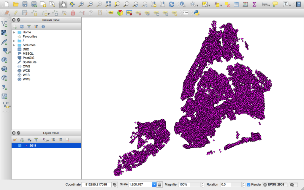
2. Download the data file lesmis.gml from the UCI Network Data Repository.  This is a network extracted from the famous French novel Les Miserables — you may also be familiar with the musical and the recent movie. Each node is a character, and there is an edge between two characters if they appear in the same chapter. Les Miserables is written in over 300 short chapters, so two characters that appear in the same chapter are very likely to meet or talk in the plot of the book. The edges are weighted, and the weight is the number of chapters those characters appear together in.

3. Open this file in Gephi, by choosing File->Open. When the dialog box comes up, set the “Graph Type” type to “Undirected.” The graph will be plotted. What do you see? Can you discern any patterns?

4. Now arrange the nodes in a nicer way, by choosing the “Force Atlas 2″ layout algorithm from the Layout menu at left and pressing the “Run” button. When things settle down, hit the “Stop” button. The graph will be arranged nicely, but it will be quite small.  You can zoom in using the mouse wheel (or two fingers on the trackpad on a mac) and pan using the right mouse button.

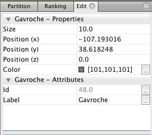
5. Select the “Edit” tool from the bottom of the toolbar on the left. It looks like a mouse pointer with question mark next to it:


Gephi info pointer

6. Now you can click on any node to see its label, which is the name of the character it represents. This information will appear in the “Edit” menu in the upper left. Here’s the information for the character Gavroche.


Gephi Gavroche properties

Click around the various nodes in the graph. Which characters have been given the most central locations? If you are familiar with the story of Les Miserables, how does this correspond to the plot? Are the most central nodes the most important characters?

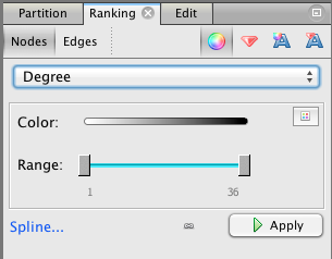
7. Make Gephi color nodes by degree. Choose the “Ranking” tab from panel at the upper left, then select the “Nodes” tab, then “Degree” from the drop-down menu. Press the “Apply” button.


screen-shot-2013-01-29-at-12-41-00-pm

Now the nodes with the highest degree will be darker. Do these high degree nodes correspond to the nodes that the layout algorithm put in the center? Are they the main characters in the story?

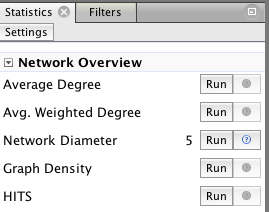
8. Now make Gephi compute betweenness and closeness centrality by pressing the “Run” button for the Network Diameter option under “Network Overview” in to the right of the screen.

Gephi network overview

You will get a report with some graphs. Just click “Close”. Now betweenness and closeness centrality will appear in the drop-down under “Ranking,” in the same place where you selected degree centrality earlier, and you can assign colors based on either run by clicking the “Apply” button.

Also, the numerical values for betweenness centrality and closeness centrality will now appear in the “Edit” window for each node.

Select “Betweenness Centrality” from the drop-down meny and hit “Apply.” What do you see? Which characters are marked as important? How does it differ from the characters which are marked as important by degree?

Now select “Closeness Centrality” and hit “Apply.” (Note that this metric uses a scale which is the reverse of the others — closeness measures average distance to all other nodes, so small values indicate more central nodes. You may want to swap the black and white endpoints of the color scale to get something which is comparable to the other visualizations.) How does closeness centrality differ from betweeness centrality and degree? Which characters differ between closeness and the other metrics?

9. Which centrality algorithm would you prefer to use to understand the structure of Les Miserables? Why? How would you validate your choice if you didn’t already know the story? That is the situation a journalist is in when they analyze unknown data.

10. Turn in: your answers to the questions in steps 3, 6, 7, 8 and 9, plus screenshots for the graph plotted with degree, betweenness centrality, and closeness centrality. (To take a screenshot: on Windows, use the Snipping Tool. On Mac, press ⌘ Cmd + ⇧ Shift + 4. If you’re on Linux, you get to tell me)

What I am interested in here is how the values computed by the different algorithms correspond to the plot of Les Miserables (if you are familiar with it), and how they compare to each other. Telling me that “Jean Valjean has a closeness centrality of X” is not a high-enough level interpretation — your couldn’t publish that in a finished story, because your readers won’t know what that means.

Due before class on Friday, December 2 

Assignment 4: Entity Extraction

For this assignment you will evaluate the performance of OpenCalais, a commercial entity extraction service, against your hand annotations.


1. Pick five random news stories and hand-annotate them. Pick an English-language news site with many stories on the home page, or a section of such a site (business, sports, etc.) Then generate five random numbers from 1 to the number of stories on the page. Cut and paste the text of each article into a separate  file, and save as plain text (no HTML, no formatting.)

2. Detect entities by hand in each article. Paste the text of each article into an RTF or Word document and go through it, underlining every entity. Count every mention of a person, place, or organization, including alternate names (“the president”) and pronoun references. Count how many entities appear in each document.

3. Now run each document through OpenCalais. You can paste the text into the demo page here. Now count:

  • Correct entities: entities found by OC and marked by you
  • Incorrect entities: entities found by OC but not marked by you
  • Missed entities: entities marked by you but not found by OC

4. Turn in:

  • Your hand-marked documents.
  • A spreadsheet. Please turn in a spread sheet with one row per document, and four columns: hand-labelled, correct, incorrect, missed
  • Make sure your spreadsheet includes totals of these four columns across all documents
  • Your analysis. Report on any patterns in the failures that your see. Where is OpenCalais most accurate? Where is it least accurate? Are there predictable patterns to the errors? Are there ambiguities as to what is really an entity?
This assignment is due before class on Friday,  November 18.

Assignment 3, Group 1: Using a multi-level linear model

Summary & Our Definition of Fairness

Before delving into the data and running any analysis, we determined that our metric for fairness would be based on “equal-opportunity” of being searched, i.e. the question we wanted to answer was: do people who live in certain areas or look a certain way more likely to be searched with no arrest? By certain areas, we mean the population breakdown of precincts, i.e. if a neighbourhood is more skewed towards a certain demographic, does it impact the likelihood of a stop and frisk?

“Disparate impact” in the U.S. Labor Law refers to activities that adversely affect a group of people of a protected characteristic (say race). This can be applied to fairness in stop-and-frisk, i.e. do people of a protected characteristic get more adversely impacted with stop-and-frisk, i.e. are there a lower number of hits?

We decided to break it down by precinct as opposed to census block, as that’s how the NYPD bureaus are divided. The fairness question that this analysis raises is with respect to the police: were the stops fair? And, if not, which precincts were particularly unfair?

Initial Investigation

Initially, before running the linear model, we ran through some basic number crunching to see if there was any evidence of unfairness. Here, we looked at two things:

  •  Figure 1 shows the hit ratio for violent crimes, by precinct, across blacks, whites, black Hispanics and white Hispanics. Here, we saw that the (twelve) lowest hit ratios were distributed between Black Hispanics (4), Whites (7) and a single white Hispanic.
    Further investigation suggested that, for the most part, the hit ratio was at around the 0.05 mark. Interestingly, for some precincts (20, 32, 42, 45, 48), where the hit ratio for non-whites was very low, the hit ratio for Whites was significantly higher.
    On the other hand, in some precincts (50, 76, 78), the hit ratio for blacks was much higher than the hit ratio for whites.
    Effectively, there was no evidence of unfairness across the board, but if we narrowed it down by precinct, there was evidence of bias.
plot

Figure 1: Hit ratio by precinct

  • Figure 2.1, 2.2 and 2.3 plot the hit ratios for blacks against precincts with different racial backgrounds. The idea behind this was: if there is racial bias in a precinct, then the hit rate for blacks in that community will be low. Or, put another way, are people more suspicious of a minority community in their midst for no good reason (which would explain the low hit rate)?
    Here, we found that in a predominantly white precinct (where 80-100% of the population was white), the hit ratio for blacks was at 0.11, whereas at a precinct where there were less than 20% whites, the number was at 0.02. But, the hit ratio for whites was, for the most part, constant ~0.08.
    In neighbourhoods that were predominantly Hispanic, on the other hand (60-80%), the hit ratio was low at 0.01. Here, the hit rate for whites was ~0.065. However, when there were less than 20% Hispanics, the hit ratio exceeded 0.07. And, for whites, it exceeded 0.08.
    Finally, in the hit ratio was high (exceeded 0.08) in precincts where the black population was sub-20% but low (0.01) where over 80% of the population was black.
    While these was interesting to note, the numbers weren’t outlandishly skewed, and consequently, there was no obvious bias evident.
Figure 2.1: Hit ratio for blacks broken down by race: black

Figure 2.1: Hit ratio for blacks broken down by precinct and race: black

Figure 2.2: Hit ratio for blacks broken down by precinct by race: Hispanic

Figure 2.2: Hit ratio for blacks broken down by precinct and race: Hispanic

Hit ratio for blacks broken down by precinct and race: White

Hit ratio for blacks broken down by precinct and race: white

Method

We ran two regressions – one on race and one on the likelihood of being detained for a reported interaction in precincts based on the racial makeup of that precinct. The precinct racial makeup data was taken from all NYC2010 census blocks with the precinct, modified by John Keefe.

Race coefficients:

First, we took a look at the differences between race after applying random effects to sex, precinct and age. Our findings show that when looking at all crime, there is not much difference between whites and blacks. Both were slightly more likely than all other races but one (P and Q together form the Hispanic group) to produce a hit. This seems to show that both whites and blacks are policed more reasonably than other races because they produce fewer stops without arrests.

However, when you remove all non-violent crime, whites are the only race where the odds of a stop producing a hit increases. All the heavily represented races (lower std. deviation) converge to zero when we remove non-violent crime, showing that there’s much less disparity. Yet, there still appears to be some racial discrimination toward non-whites.

Race coefficeint

Race coefficients with random effects on age, sex, pct

screen-shot-2016-11-04-at-8-31-34-am

Race coefficients (Violent crimes only) with random effects on sex, age, precinct

Precinct coefficients:

By running a regression on the percentage of each precinct that was of a given race for black, white and Hispanic, we hoped to be able to identify any racial disparities between policing in particular precincts.

Both the violent-only and full set of data seem to show significant differences between whites and blacks. When factoring in non-violent crime, it appears black communities have many more stops without arrests than either the white or the Hispanic communities.

Our findings also seem to show predominantly white communities could use more policing to cut down on violent crime, as stopping a person in a white precinct increases the chances of a hit when only looking at violent crime. However, black and Hispanic communities are pretty much on par with each other with violent-only crime.

screen-shot-2016-11-04-at-8-32-53-am

Arrests by Precinct with random effects on age, sex

screen-shot-2016-11-04-at-8-34-23-am

Arrests by Precincts (violent crimes only)

Residual effects:

We can see that if we breakdown our LME model by hit ratio vs. the precinct (with random effects on precinct), we get a fairly straight line, indicating that we get a fairly reliable predictor using just the precinct.

pct_random

What is interesting, though, is that this doesn’t change significantly when we add race to the mix, indicating that using the precinct in isolation doesn’t decrease the reliability of the predictor compared to using a combination of the precinct and race.

There would be no disparate impact if the probability of hits given race is equivalent to the probability of hits when race is absent (i.e. P(hits | race == 1) ≈ P(hits | race == 0)). We can see that this is the case here.

pct_random2

Final thoughts 

For the most part, through this exercise, we didn’t see a lot of bias in policing. There is evidence that some precinct are more biased – or more unfair – than others, using our definition of “unfairness”, but not enough where we can claim there is systematic bias.

The residual effects chart is probably the most interesting, as it seems to indicate that throwing race into the mix doesn’t improve predictability – but, that could be explained by bias already being built into the precinct. Or, because, policing had become more careful in the early 2010s after the accusations of bias in the mid-to-late noughties.

Assignment 3 Group 2: Bayesian Mixed Model Used with STAN

By Chi-An Wang, Dailin Shen=

Threshold Test Model

We believe the threshold test is a better model compared to the benchmark test and the outcome test. The benchmark test has the qualified pool problem that might overlook the case that the officers are doing good policing. The outcome test also has the problem of infra-marginality problem that might speculate discrimination while there is not. These two model have the advantage of easier to compute and intuitiveness but might neglect some of the key features in the process of policing.

Why do we think threshold test is a fair metric?

Being bias is having a double standard, and threshold test well mapped this concept to having a lower threshold of deciding to search the stopped driver. Simoiu added two important features, the subjective probabilities, and search threshold, as a latent variable into the threshold test model. The subjective probabilities p (the officers feeling about the driver possessing contraband) is drawn from a binomial distribution parameterized by 1. Phi_{rd} and lambda_{rd}. Phi_{rd} models the probability that a driver is carrying contraband and lambda express the difficulty in distinguishing between guilty and innocent drivers. The threshold is the most important latent variables inferred from data so that we can compare between different race.

This modeling makes sense since it models the real-world process of P making decisions. Rather than only based on the stop and frisk results, they assume that how the people reacted to the police and its appearance would also be taken into consideration into the beta distribution.  It also takes the difference between each precinct into consideration.

Although Police making a calibrated decision might not be totally realistic, but we would argue that the data that we’re modeling is a single year dataset of 2011. The long-term variation in this year might not be huge. For example, a young police might not be tough until working for several years while an old police might not change its way of policing after 30 years.

Data Preprocessing – iPython Notebook

1 Contraband

The paper “Testing for Racial Discrimination in Police Searches of Motor Vehicles” categorized four types of contrabands, including drugs, alcohol, weapons, and money. While, the description in the file specifications of the database ( NYPD Stop Question Frisk Database 2015) only showed a single type of contraband, which was the weapon. Also, we found the database concentrated more on different kinds of weapons, like rifles, pistols, assault weapons and knife cuttings. Hence we decided to use these four types of weapons as one of our proxies to prediction.

2 Race

There are eight different races in our dataset, which includes A(“Asian/Pacific Islander”), B(“Black”), I(“American Indian/Alaskan Native”), P(“Black-Hispanic”), Q(“White-Hispanic”), W(“White”), X(“Unknown”), Z(“Other”).  We decided to merge Black-Hispanic and White-Hispanic based on the assumption that people in the States, especially the officers, are capable of telling them apart from Black and White. Therefore to provide a slightly bigger dataset and make good use of them, we decided to merge them and drop all other smaller races.

3 Age

We noticed that the age in our dataset ranged from 0 to 999, although most of the ages clustered obeyed the normal distribution. To let calculation make more sense, according to news publications, we found that the longest age in the USA is 116, hence we omitted the observations with the age over 116.

Benchmark

Figure 1: Results of benchmark on a department-by-department basis. Each circle in the diagram refers to a police department and the affiliated search rate of minority compared to White search rate.

Figure 1: Results of benchmark on a department-by-department basis. Each circle in the diagram refers to a police department and the affiliated search rate of minority compared to White search rate.

The X-axis in Figure 1 is the observed White search rate, and, the Y-axis is the observed Minority search rate. Each point in the diagram compares search rates of minority and white drivers for a single department. The size of a point illustrates the number of drivers being stopped by the department. We expect to see all the points locating on the diagonal line if there is no discrimination against minorities. Otherwise, if all the points locate above the diagonal line, a discrimination exists; if all the points locate below the diagonal line, there is no discrimination . According to Figure 1,  so far, we incline to say that there is a slightly discrimination against Black and slightly group, but no clear discrimination against Asian drivers.

Outcome

Figure 2: Results of outcome test on a department-by-department basis. Each circle in the diagram compares the corresponding department hit rates. Different with benchmark test, the outcome test showed that the majority of the police departments had a subtle discrimination against Black and Hispanic.

Figure 2: Results of outcome test on a department-by-department basis. Each circle in the diagram compares the corresponding department hit rates. Different with benchmark test, the outcome test showed that the majority of the police departments had a subtle discrimination against Black and Hispanic.

Similar to the Figure 1, if there is no discrimination, all the points in the diagram are expected to locate on the diagonal line. But if they are clustered below the line, we conclude that the hit rate of the minority is below that of White group, leading to a discrimination against the minority. According to Figure 2, the hit rate of Black and Hispanic are below the diagonal line, from which locate a discrimination against Black and Hispanic. Still, no discrimination shows against Asian drivers.

Threshold

Figure 3: Diagram of the threshold tested computed on the 76 police departments in New York Island Area. Similarly, each point refers to the numbers of minorities stopped by each department. Most of the departments stopped Black with a lower threshold compared to White, meaning that a discrimination exists.

Figure 3: Diagram of the threshold tested computed on the 76 police departments in New York Island Area. Similarly, each point refers to the numbers of minorities stopped by each department. Most of the departments stopped Black with a lower threshold compared to White, meaning that a discrimination exists.

Out of expectation, in the Hispanic/White threshold diagram, all of the departments had almost the same threshold for Hispanic indicating that they were consistent while stopping Hispanic. However, their consistency still indicates a racial bias while having a lower search threshold for Hispanic.

Figure 4: Averaging the race-specific search threshold and signal distribution among all the departments, we found that the likelihood of carrying contraband from Hispanic and Black was slightly lower than White and Asian given the density, suggestive of discrimination against Black and Hispanic. The gap between those four groups was not clear to claim that police forces were biased during stop and frisk operations.

Figure 4: Averaging the race-specific search threshold and signal distribution among all the departments, we found that the likelihood of carrying contraband from Hispanic and Black was slightly lower than White and Asian given the density, suggestive of discrimination against Black and Hispanic. The gap between those four groups was not clear to claim that police forces were biased during stop and frisk operations.

search_rate_ppc

Figure 5: Compared the diagram of predicted search rate, the diagram of predicted hit rate to the actual, observed values. Each circle in the diagram referred to the associated race-paired department. The size of the circle represented the number of stops made by the related police department.

Figure 5: Compared the diagram of predicted search rate, the diagram of predicted hit rate to the actual, observed values. Each circle in the diagram referred to the associated race-paired department. The size of the circle represented the number of stops made by the related police department.

The model fitted well for both search rate and hit rate. No matter how much the search rate/hit rate grows, the prediction error was generally constant. Most of the large bubbles were around the middle line indicating that the model fits the larger groups of department-race pairs well. However, there is a mysterious straight line in the predicted hit rate/ hit rate prediction error chart that might be caused by our buggy data.

Debug Documentation

1 SUM()

Error in eval(substitute(expr), envir, enclos) :  ‘sum’ not meaningful for factors.

Variables in data frames are considered as factors.  However, the sum function doesn’t take factors as a valid input data type which caused the error while fitting data.

2 Binomial Indexes

“Exception thrown at line 104: binomial_log: Successes variable[231] is 8, but must be in the interval [0, 7]”

In order to find this bug, we tracked the r, n, s, h value of variable[231]. Here is what we found: r[231] = 4, n[231] = 17, s[231] = 7, h[231] = 8. The problem is obvious, the hit (h) count cannot be higher than search (s) count! This made us think about: is any chance in our database that some contrabands found without any search conducted? Fun fact, more than 3000 pieces of observations from more than 660,000 pieces showed without a search, officers still found contraband. Hence, we filtered out the rows with contraband found but without any search conducted and fixed the problem.

Reference:

Threshold test source code


Adding NYPD Precinct to Stop & Frisk Data

Here’s a tutorial on the steps I went through to generate the data for Assignment 3, statistical modeling of stop & frisk data with precinct as the unit of analysis. The first problem is adding a precinct ID to every stop and frisk event, which means matching stop locations to precinct areas. To get baseline racial makeup we also need to sum census data over precincts.

Thanks to John Keefe of WNYC for valuable data and advice.

Just the data

  • Here is NYPD’s 2011 stop & frisk data, with appended precinct and lat/long. The column names are explained here.
  • Here are all all NYC 2010 census blocks, with appended precinct, from John Keefe, and here is the census data dictionary (see pp.6-10)

How to make this data

1. First, download NYPD raw stop and frisk data here. I used 2011, since that was the year with the most stops before the program was drastically curtailed. There’s also documentation on that page, which explains the data format

2. The XCOORD and YCOORD columns record the position of each stop, in the “New York-Long Island State Plane Coordinate System” also known as EPSG 2908. To do anything useful with this, we’re going to need to convert into lat/long using QGis. Use Layer -> Add Layer -> Add Delimited Text Layer to load the CSV file. It should automatically guess the correct column names. When asked, pick EPS 2908 for the coordinate system. If all goes well, you are now looking at this:

NYPD 2011 Stop and Frisk data in QGis

3. We need to save this in a more standard coordinate system for comparison to precinct boundaries. Right click on the “2011” layer and Save As as an ESRI Shapefile with CRS (“coordinate reference system”) of WGS84, which should also be the “Project CRS.” Ensure “add saved file to map” is checked. Now you’ve got a new layer in standard GPS-style lat/long coordinates.

4. Now we need to know the geographic outlines for each police precinct. The raw shape files are here, or your can look at them in a Fusion Table here. In QGIS, Use Add Layer -> Add Vector Layer and select the precinct shapefile (nypp_4326.zip).

5. To assign points to their precinct, run Add polygon attributes to point in the data processing toolbox (Processing -> Toolbox). The “Precinct” field should appear automatically. Again you’ll have a new layer. Right click and save that as a CSV. You should end up with a file that is exactly the same as the NYPD’s 2011 CSV, but with lat/long and precinct columns added.

6. Keefe has also done the work of enriching New York City census blocks with precinct keys, which he’s put in this this  Fusion Table. The data above is a CSV download of this file.


Assignment 3: Analyze Stop and Frisk for Racial Bias

For this exercise, you will break into three groups. Two will analyze data, and the third will do legal research. The data for this assignment is available here. All groups will turn in their assignment by posting on this blog — you’ll have logins shortly — and linking to a github repository of your code.

All groups: How can we encode our ideas about racial fairness into a quantitative metric? That is the fundamental question underlying this assignment and you must answer it. Don’t build models that give you answers to useless questions; each model you build must embody some justifiable concept of fairness. Many such metrics have been proposed; part of the assignment is researching and evaluating them. I’ve proposed some models that might be interesting, but I’ll be just has happy — perhaps happier — to have you tell me why these particular model formulations will not yield an interesting result. Also, you have to tell me what your modeling results mean. Is there bias? In what way, how significant is it, and what are alternate explanations? Uninterpreted results will not get a passing grade.

Group 1: Analyze the stop and frisk data using a multi-level linear model

This group will analyze the data along the lines of Gelman 2006. However, that paper used Bayesian estimation whereas this team will used standard linear regression. Use RStudio with the lme4 package, as described in this tutorial.

As above, you need to choose and justify quantitative definitions of fairness. Should you look at stop rate? Hit rate? And should you compare to the racial composition of each precinct? Or per-race crime rates? And if so, which crimes?

Each conceptual definition of fairness can be embodied in many different statistical models. Compare at least two different statistical formulations. For example you might end up modeling:

  • hit rate vs race, per precinct
  • hit rate vs race, per precinct, with precinct random effects

You must also choose the unit of analysis. Is precinct or census block a better unit? Why? Or you could compare the same model on different units.

Your final post must include a justification of the metric and model choices, and useful visualization of the results, and interpretation of both the regression coefficients and uncertainty measures (standard errors on regression coefficients, and modeling residuals.)

Group 2: Analyze the stop and frisk data using a Bayesian model

This group will analyze the data along the lines of Simoiu 2016. For a tutorial on how to set up Bayesian modeling in R, see Bayesian Linear Mixed Models using STAN.

As with group 2, you must research and choose a definition of fairness, fit at least two different statistical formulations, and interpret your results including the uncertainty (posterior distributions and residuals.) Be sure to visualize your model fit, as in figure 7 of Simoiu.

I would be happy to see you replicate the threshold test of Simoiu. However, I want you to explain why the threshold test makes sense as a fairness metric. If it doesn’t make sense I want you to design a new model. Perhaps the assumption that each officer can make correctly calibrated estimates of the probability that someone is carrying contraband is unrealistic, and your model should be based on the idea that the estimates are biased and try to model that bias as latent variables.

Group 3: Research legal and policy precedent for statistical tests

This group will scour the legal literature to determine what sorts of statistical tests have been used, or could be used, to answer legal questions of discrimination. You will also research the related policy literature: what sorts of tests have governments, companies, schools etc. used to evaluate the presence or significance of discrimination. For an entry into the literature, you could do worse than to start with the works referenced by Big Data’s Disparate Impact.

This group will not be coding, but I expect you to ask not only what fairness metrics might be appropriate (as the other groups must also do) but 1) whether or not these metrics might hold up in court and 2) whether they have ever been used outside of court.

And one particular question I would like you to answer: would Simiou’s “threshold test” have legal or policy relevance?

Submitting your Results

All groups will report their results on this blog, and present their findings to the class on Friday, November 4.

Assignment 2: Filter design

For this assignment you will design a hybrid filtering algorithm. You will not implement it, but you will explain your design criteria and provide a filtering algorithm in sufficient technical detail to convince me that it might actually work — including psuedocode.

1. Decide who your users are. Journalists? Professionals? General consumers? Someone else?

2. Decide what you will filter. You can choose:

  • Facebook status updates, like the Facebook news feed
  • Tweets, like Trending Topics or the many Tweet discovery tools
  • The whole web, like Google News
  • something else, but ask me first

3. List all available information that you have available as input to your algorithm. If you want to filter Facebook or Twitter, you may pretend that you are the company running the service, and have access to all posts and user data — from every user. You also also assume you have a web crawler or a firehose of every RSS feed or whatever you like, but you must be specific and realistic about what data you are operating with.

4. Argue for the design factors that you would like to influence the filtering, in terms of what is desirable to the user, what is desirable to the publisher (e.g. Facebook or Prismatic), and what is desirable socially. Explain as concretely as possible how each of these (probably conflicting) goals might be achieved through in software. Since this is a hybrid filter, you can also design social software that asks the user for certain types of information (e.g. likes, votes, ratings) or encourages users to act in certain ways (e.g. following) that generate data for you.

5. Write psuedo-code for a function that produces a “top stories” list. This function will be called whenever the user loads your page or opens your app, so it must be fast and frequently updated. You can assume that there are background processes operating on your servers if you like. Your psuedo-code does not have to be executable, but it must be specific and unambiguous, such that I could actually go and implement it. You can assume that you have libraries for classic text analysis and machine learning algorithms. So, you don’t have to spell out algorithms like TF-IDF or item-based collaborative filtering, or anything else you can dig up in the research literature, but simply say how you’re going to use such building blocks. If you use an algorithm we haven’t discussed in class, be sure to provide a reference to it.

6. Write up steps 1-5. The result should be no more than three pages. You must be specific and plausible. You must be clear about what you are trying to accomplish, what your algorithm is, and why you believe your algorithm meets your design goals (though of course it’s impossible to know for sure without testing; but I want something that looks good enough to be worth trying.)

Due before class, October 21

Assignment 1: Topic Modeling

This assignment is designed to help you develop a feel for the way topic modeling works, the connection to the human meanings of documents, and common ways of handling a time dimension. You will analyze the State of the Union speeches corpus, and report on how the subjects have shifted over time in relation to historical events.

1. Download the source data file state-of-the-union.csv. This is a standard CSV file with one speech per row. There are two columns: the year of the speech, and the text of the speech. You will write a Python program that reads this file and turns it into TF-IDF document vectors, then prints out some information. Here is how to read a CSV in Python. You may need to add the line

csv.field_size_limit(1000000000)

to the top of your program to be able to read this large file.

The file is a csv with columns year, text. Note: there are some years where there was more than one speech! Design your data structures accordingly.

2) Feed the data into gensim. Now you need to load the documents into Python and feed them into the gensim package to generate tf-idf weighted document vectors. Check out the gensim example code here. You will need to go through the file twice: once to generate the dictionary (the code snippet starting with “collect statistics about all tokens”) and then again to convert each document to what gensim calls the bag-of-words representation, which is un-normalized term frequency (the code snippet starting with “class MyCorpus(object)”

Note that there is implicitly another step here, which is to tokenize the document text into individual word features — not as straightforward in practice as it seems at first, but the example code just does the simplest, stupidest thing, which is to lowercase the string and split on spaces. You may want to use a better stopword list, such as this one.

Once you have your Corpus object, tell gensim to generate tf-idf scores for you like so.

3) Do LSI topic modeling. You can apply LSI to the tf-idf vectors, like so. You will have to supply the number of topics to generate. Figuring out a good number is part of the assignment. Print out the resulting topics, each topic as a lists of word coefficients. Now, sample ten topics randomly from your set for closer analysis. Try to annotate each of these ten topics with a short descriptive name or phrase that captures what it is “about.” You will likely have to refer to the original documents that contain high proportions of that topic, and you will likely find that some topics have no clear concept.

Turn in: your annotated topics plus a comment on how well you feel each “topic” captured a real human concept.

4) Now do LDA topic modeling. Repeat the exercise of step 3 but with LDA instead, again trying to annotate ten randomly sampled topics. What is different?

Turn in: your annotated topics plus a comment on how LDA differed from LSI.

5) Now choose one of the following exercises:

a) Come up with a method to figure out how topics of speeches have changed over time. The goal is to summarize changes in the State of the Union speech in each decade of the 20th and 21st century. There are many different ways to use topic modeling to do this. Possibilities include: visualizations, grouping speeches by decade after topic modeling, and grouping speeches by decade before topic modeling. You can base your algorithm on either LSI or LDA, whichever you feel gives the most insight. Choose a method, then use your decade summarization algorithm to understand what the content of speeches was in each decade.

Turn in: a description of your decade summarization algorithm, and an analysis of how the topics of the State of the Union have changed over the decades of the 20th century. What patterns do you see? Can you connect the terms to major historical events? (wars, the great depression, assassinations, the civil rights movement, Watergate…)

or b) Analyze a different document set. Try LDA on a different document set, this collection of AP wire stories. Repeat the process of choosing the number of topics, fitting a model, and interpreting a random sample of 10 of them. Are the topics any clearer on this document set? If so, why? You may wish to look at previous LDA results on these documents, the top 20 words from 100 topics.

Turn in: your annotated topic sample, plus a description of the differences between the output on these documents vs. the State of the Union documents. Does one work better than the other? If so, define “better.”

This assignment is due Friday, October 7 at 10:00 AM. You may email me the results.

Syllabus Fall 2016

The course is a hands-on introduction to the areas of computer science that have a direct relevance to journalism, and the broader project of producing an informed and engaged public. We will touch on many different technical and social topics: information recommendation systems but also filter bubbles, principles of statistical analysis but also the human processes which generate data, network analysis and its role in investigative journalism, visualization techniques and the cognitive effects involved in viewing a visualization. Assignments will require programming in Python, but the emphasis will be on clearly articulating the connection between the algorithmic and the editorial.

Our scope is wide enough to include both relatively traditional journalistic work, such as computer-assisted investigative reporting, and the broader information systems that we all use every day to inform ourselves, such as search engines and social media. The course will provide students with a thorough understanding of how particular fields of computational research relate to journalism practice, and provoke ideas for their own research and projects.

Research-level computer science material will be discussed in class, but the emphasis will be on understanding the capabilities and limitations of this technology. Students with a CS background will have opportunity for algorithmic exploration and innovation, however the primary goal of the course is thoughtful, application-oriented research and design.

Format of the class, grading and assignments.
This is a fourteen week course for Masters’ students which has both a six point and a three point version. The six point version is designed for CS & journalism dual degree students, while the three point version is designed for those cross listing from other schools. The class is conducted in a seminar format. Assigned readings and computational techniques will form the basis of class discussion. The course will be graded as follows:

  • Assignments: 80%. There will be a homework assignment after most classes.
  • Class participation: 20%

Assignments will be completed in groups (except dual degree students, who will work individually) and involve experimentation with fundamental computational techniques. Some assignments will require intermediate level coding in Python, but the emphasis will be on thoughtful and critical analysis. As this is a journalism course, you will be expected to write clearly.

Dual degree students will also have a final project. This will be either a research paper, a computationally-driven story, or a software project. The class is conducted on pass/fail basis for journalism students, in line with the journalism school’s grading system. Students from other departments will receive a letter grade.

Week 1: Introduction and Clustering – 9/16
Slides
First we ask: where do computer science and journalism intersect? CS techniques can help journalism in four different areas: data-driven reporting, story presentation, information filtering, and effect tracking. Then we jump right into high dimensional data analysis and visualization, which we’ll need to study filtering, with an example of clustering, visualizing, and interpreting feature vectors of voting patterns.

Required

Recommended

  • Precision Journalism, Ch.1, Journalism and the Scientific Tradition, Philip Meyer

Viewed in class

Unit 1: Filtering

Week 2: Text Analysis – 9/23
Slides
Can we use machines to help us understand text? In this class we will cover basic text analysis techniques, from word counting to topic modeling. The algorithms we will discuss this week are used in just about everything: search engines, document set visualization, figuring out when two different articles are about the same story, finding trending topics. The vector space document model is fundamental to algorithmic handling of news content, and we will need it to understand how just about every filtering and personalization system works.

Required

Recommended

Examples

  • Watchwords: Reading China Through its Party Vocabulary, Qian Gang

Assignment:  LDA analysis of State of the Union speeches.

Week 3: Filtering algorithms
Slides
This week we begin our study of filtering with some basic ideas about its role in journalism. We will study the details of several algorithmic filtering approaches including Twitter, Reddit’s comment ranking, the Newsblaster system  (similar to Google News) and the New York Times recommendation engine.

Required

Recommended

Discussed in class

Week 4: Filters as Editors 
Slides
We’ve seen what filtering algorithms do, but what should they do? This week we’ll study the social effects of filtering system design, how Google Search and other systems are optimized in practice, and start to ask about possible ill effects like polarization and fake news.
Required

Recommended

Viewed in class

Assignment – Design a filtering algorithm for an information source of your choosing

Unit 2: Interpreting Data

Week 5: Quantification, Counting, and Statistics
Slides
Every journalist needs a basic grasp of statistics. Not t-tests and all of that, but more grounded. Where does data come from at all? How do we know we’re measuring the right thing, and measuring it properly? Then a solid understanding of the concepts that come up most in journalism: relative risk, conditional probability, the regressions and control variables, the use of statistical models generally. Finally, the state of the art in data-driven tests for discrimination.

Recommended

Week 6: Drawing conclusions from data 
Slides
This week is all about using data to report on ambiguous, complex, charged issues. It’s incredibly easy to fool yourself, but fortunately, there is a long history of fields grappling with the problem of determining truth in the face of uncertainty, from statistics to intelligence analysis. This week includes: statistical testing and statistical significance, Bayesianism in theory and practice, determining causality, p-hacking and reproducibility, analysis of competing hypothesis.

Required

Recommended

Viewed in class

Assignment: Analyze NYPD stop and frisk data for racial discrimination. Details here.

Week 7: Algorithmic Accountability 
Slides
Our society is woven together by algorithms. From high frequency trading to predictive policing, they regulate an increasing portion of our lives. But these algorithms are mostly secret, black boxes form our point of view. We’re at they’re mercy, unless we learn how to interrogate and critique algorithms. We’ll focus in depth on analysis of discrimination of various types, and how this might (or might not) be possible in computational journalism.

Required

Recommended

Unit 3: Methods

Week 8: Visualization 
Slides
An introduction into how visualization helps people interpret information. Design principles from user experience considerations, graphic design, and the study of the human visual system. The Overview document visualization system used in investigative journalism.

Required

Recommended

Week 9: Knowledge representation 
Slides
How can journalism benefit from encoding knowledge in some formal system? Is journalism in the media business or the data business? And could we use knowledge bases and inferential engines to do journalism better? This gets us deep into the issue of how knowledge is represented in a computer. We’ll look at traditional databases vs. linked data and graph databases, entity and relation detection from unstructured text, and traditional both probabilistic and propositional formalisms. Plus: NLP in investigative journalism, automated fact checking, and more.

Required

Recommended

Viewed in class

Assignment: Text enrichment experiments using StanfordNER entity extraction.

Week 10: Network analysis 
Slides
Network analysis (aka social network analysis, link analysis) is a promising and popular technique for uncovering relationships between diverse individuals and organizations. It is widely used in intelligence and law enforcement, but not so much in journalism. We’ll look at basic techniques and algorithms and try to understand the promise — and the many practical problems.

Required

Recommended

Examples:

Assignment: Compare different centrality metrics in Gephi.
Week 11: Privacy, Security, and Censorship 
Slides
Who is watching our online activities? How do you protect a source in the 21st Century? Who gets to access to all of this mass intelligence, and what does the ability to survey everything all the time mean both practically and ethically for journalism? In this lecture we will talk about who is watching and how, and how to create a security plan using threat modeling.

Required

Recommended

Assignment: Use threat modeling to come up with a security plan for a given scenario.

Week 12: Tracking flow and impact 

How does information flow in the online ecosystem? What happens to a story after it’s published? How do items spread through social networks? We’re just beginning to be able to track ideas as they move through the network, by combining techniques from social network analysis and bioinformatics.

Required

Recommended

 Final projects due 12/31  (dual degree Journalism/CS students only)

Assignment 5: Interpreting Data

For this assignment you will write a short news story about the status of women in academic science. You can use any sources you like. The recent paper Women in Academic Science: A Changing Landscape by Ceci. et al. contains a lot of data you might find relevant however I expect you to use multiple sources.

I will look for the following things in marking your story:

1) What question or questions are you using data to answer? “The status of women” could mean many different things. You must be clear about what you are writing about, and how this relates to the broader concept described by the words “the status of women in academic science.”

2) What data did you choose to get your answer? Please clearly present this data and explain what it means. Include tables or graphs if appropriate.

3) How was this data collected? How do you know it is accurate? How do you know it means what you think it means? I want to see that you have at least considered the questions on the “interview the data” slide.

4) What other hypotheses, if any, fit the data you have chosen? Why is your explanation more correct than the other possible explanations? Could multiple explanations be true at the same time?

5) Is there other data that supports your conclusion? What about non-data sources of information? We have discussed triangulation many times in class, and I want to see evidence of it here. A strong argument combines different types of evidence from different sources.

6) Have you accounted for the possibility that what you see in the data has happened by chance? What are the sources of random variation here, and why is the pattern you see not likely to occur by chance?

7) Your story must be a maximum of 500 words and written for a general audience. That means you cannot assume that the reader is familiar with data concepts. If you need to use an idea that would not be familiar to someone who has never studied statistics or worked with data, you must explain what that idea means.

Due Dec 18 before class.